OVERVIEW
The objective of this project was to create a cohesive, intentional, cultural publication that celebrates and honors the diversity/versatility of natural hair. Within a professional publication that follows many local and global rules, it blends ancestral heritage with modern day, leaving you feeling proud and empowered in your natural state.
PART I: WORDMARK
The first step in this project was to create a word mark for the publication. I decided to use Nappy as a way to reclaim a term often used towards natural hair in a derogatory way, instead flipping it into a celebration. The goal was for hair to be reflected in every part of this project, including the word mark itself.
RESEARCH
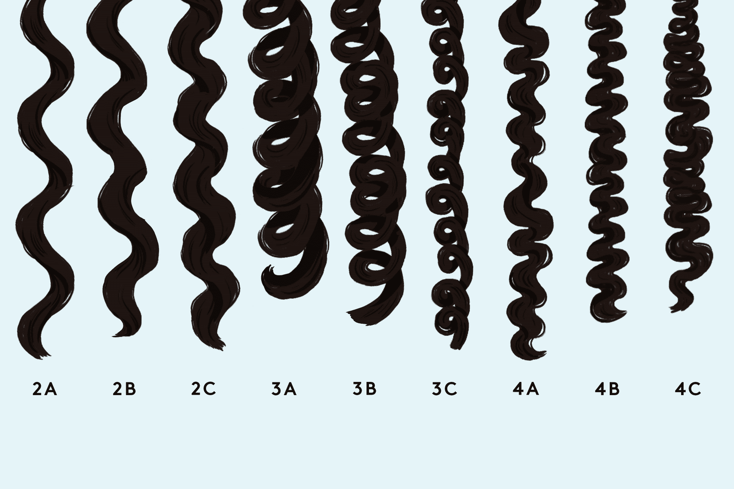
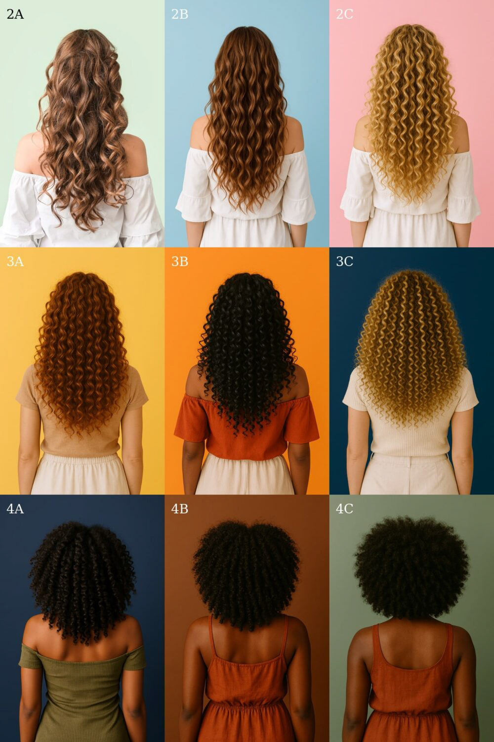
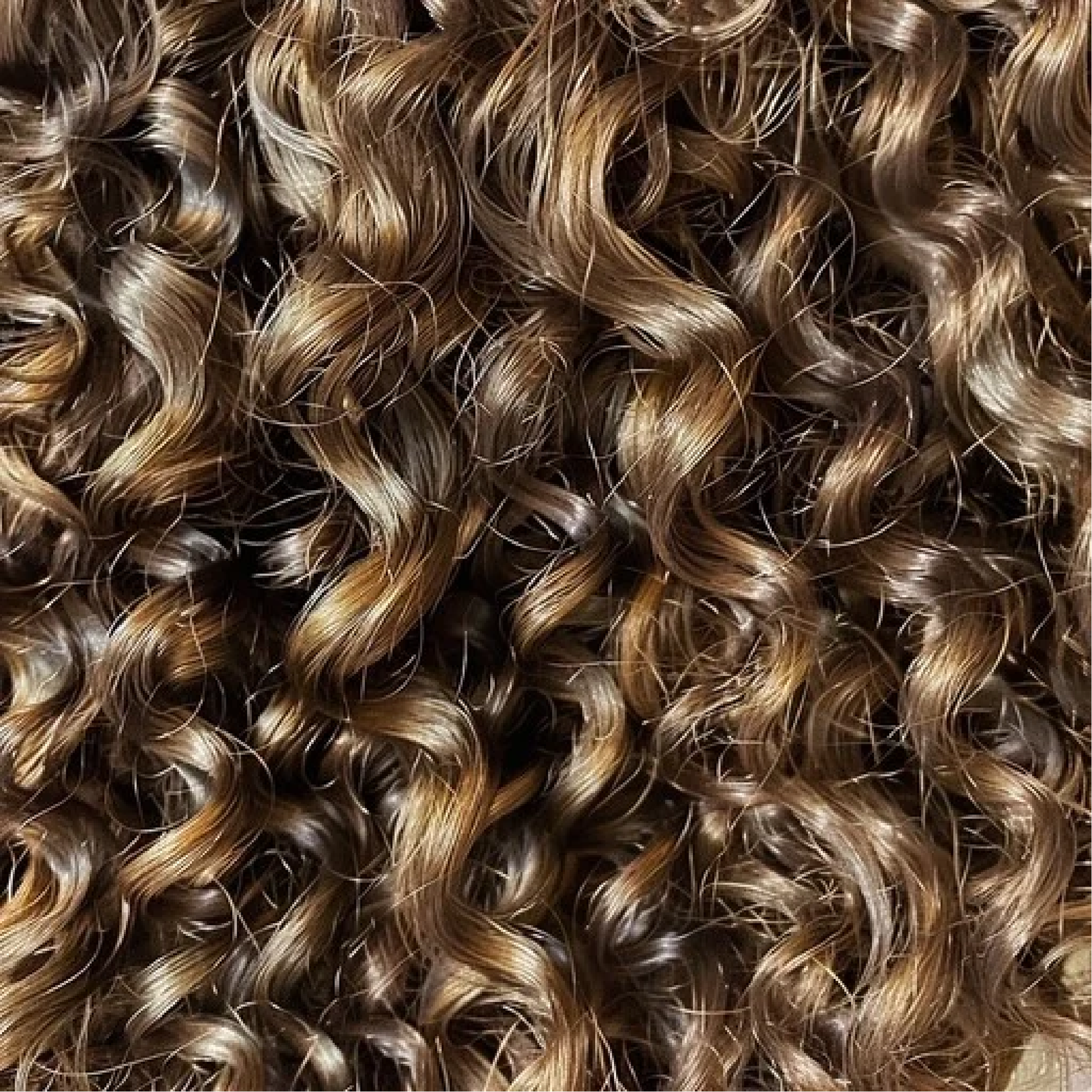
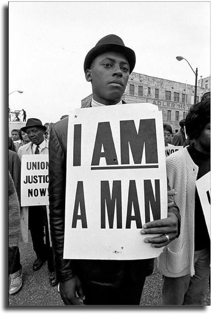
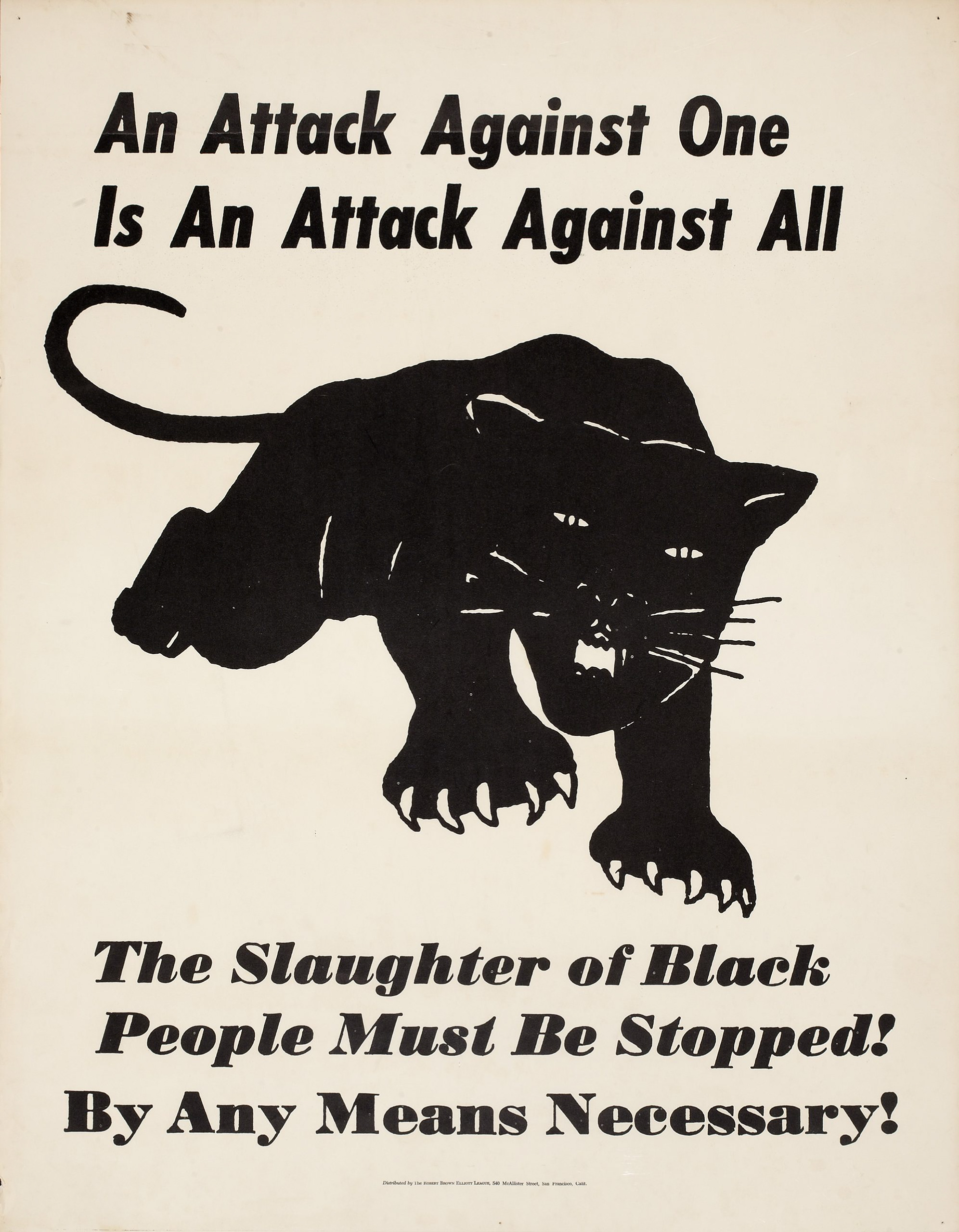
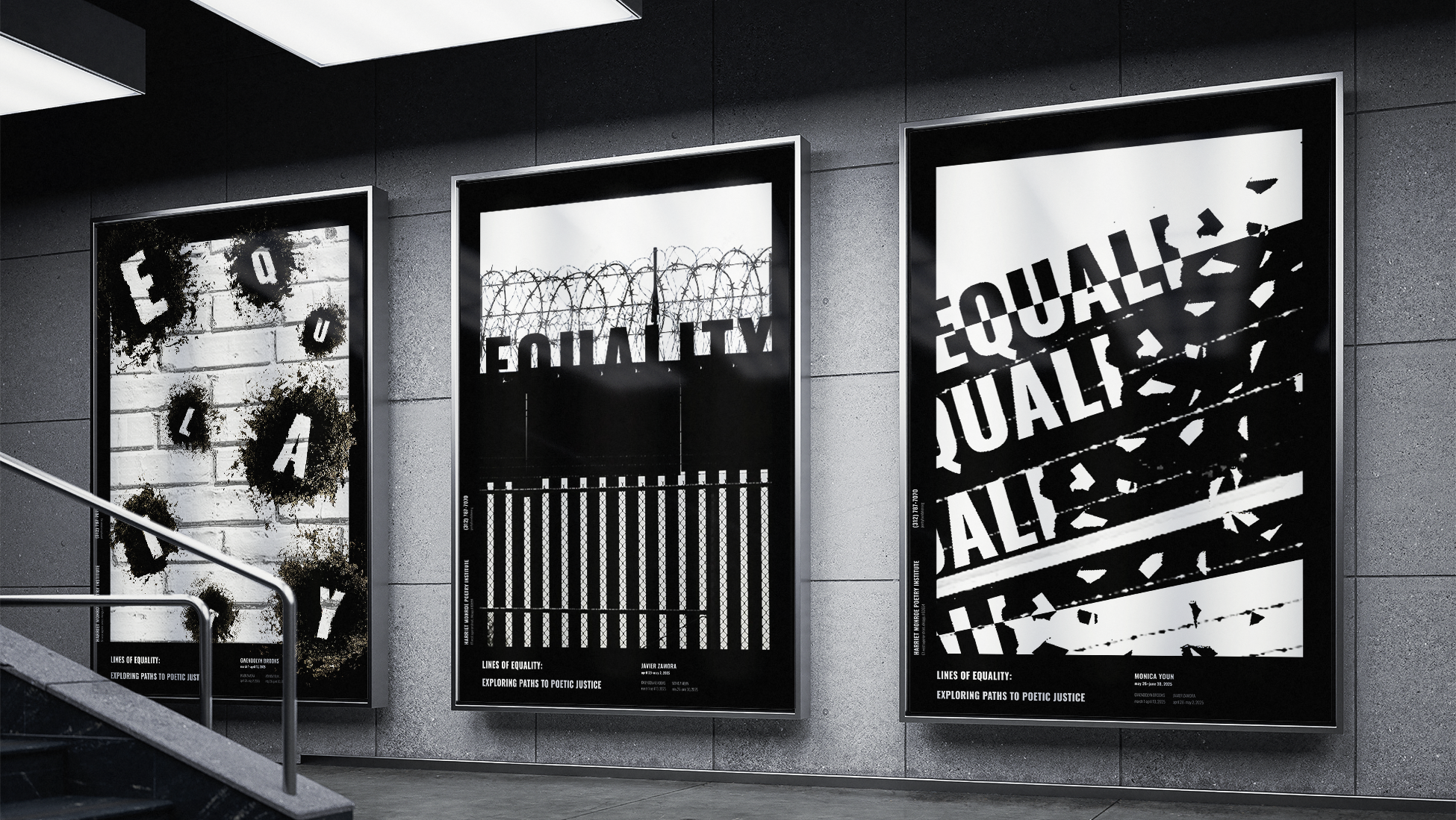
In depth research of the many different curl patterns within natural hair was conducted in order to understand how to reflect that within the foundations of the word mark. Civil and Equal Rights protests posters were also studied to reference the typefaces of that time, adding a sense of reclamation and empowerment.
SKETCHING
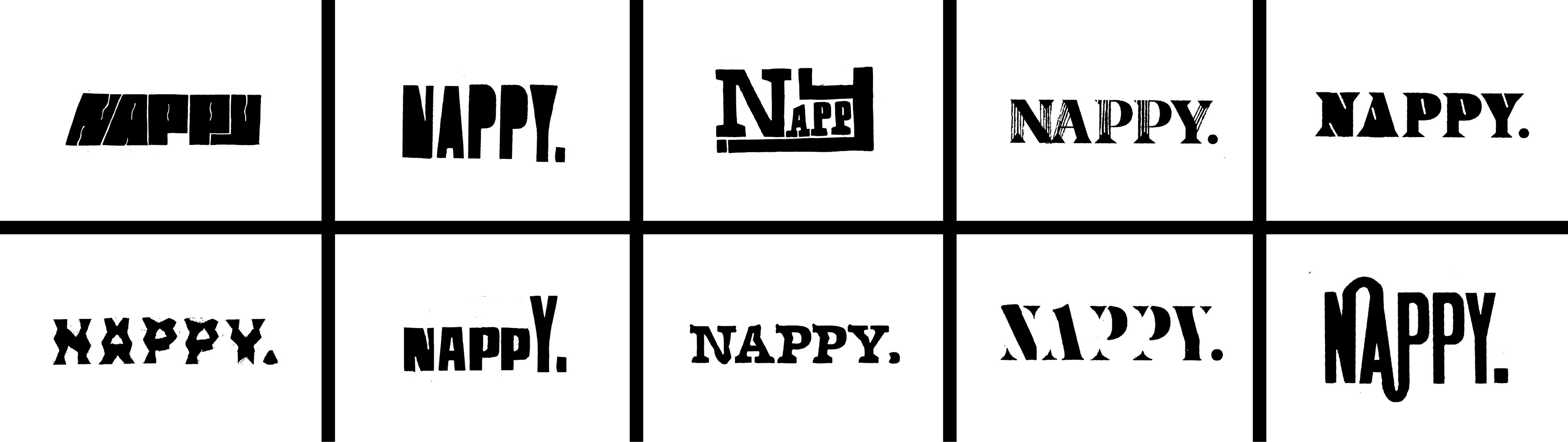
Many different concepts were explored via hand sketching in order to determine what expressed the feel of natural hair best, and what did not. This sketching helped me step away from "too-literal" interpretations and instead reflect natural hair within the letterforms themselves.
DIGITAL DEVELOPMENT
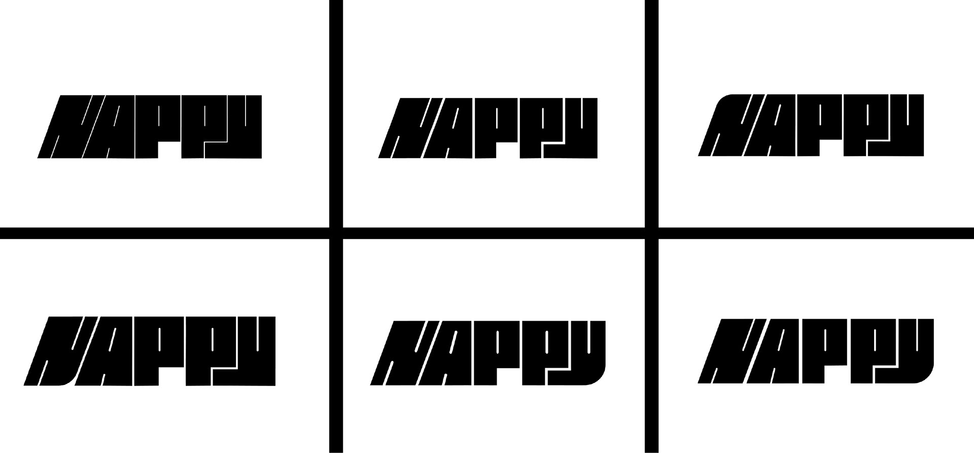
Once the bold, dense direction was decided, I translated it digitally to further refine it and communicate my message. Here, I mainly explored the curve language of letterforms, thickness of counters, and spacing between letterforms.
FINAL MARK
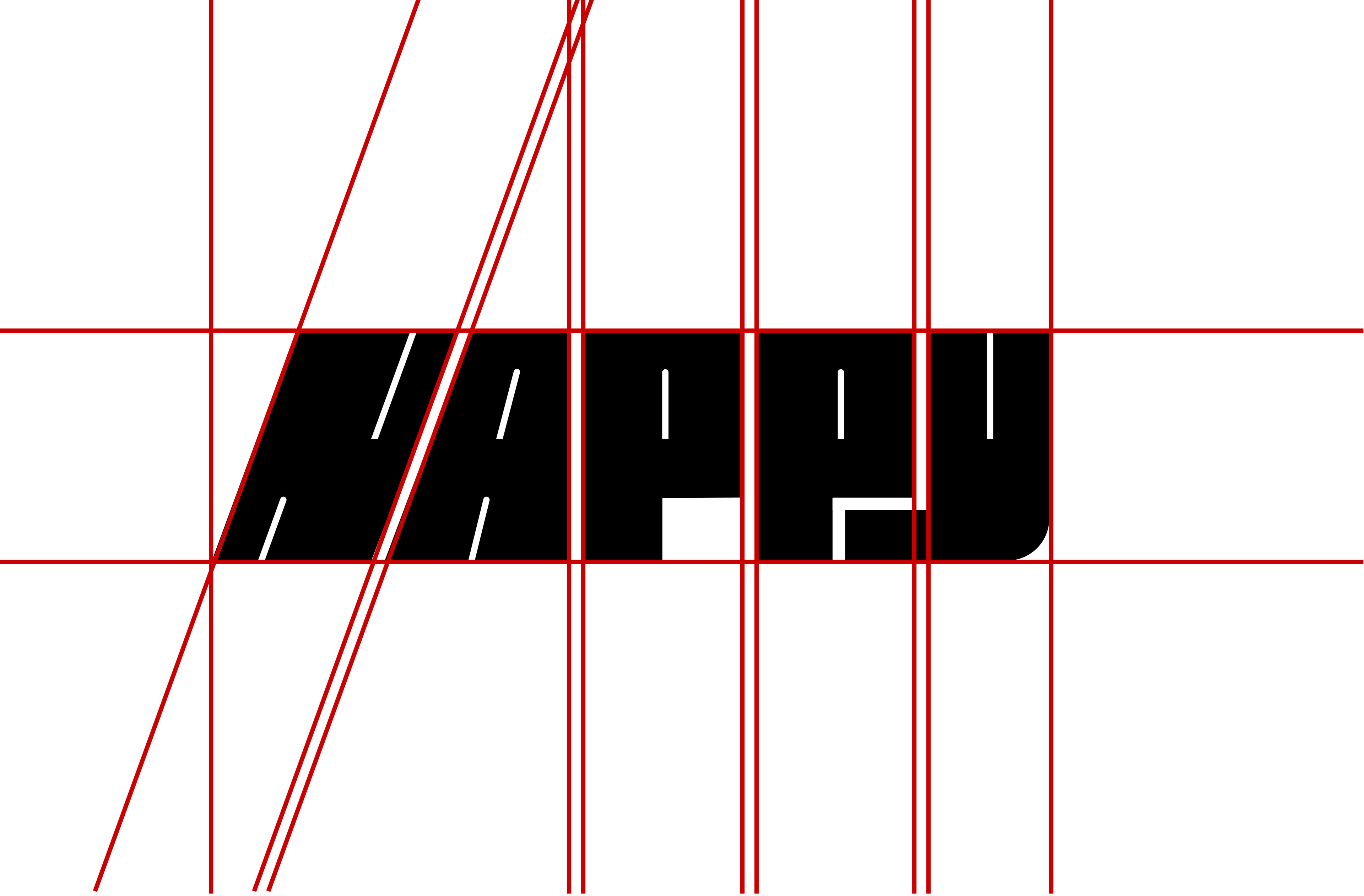
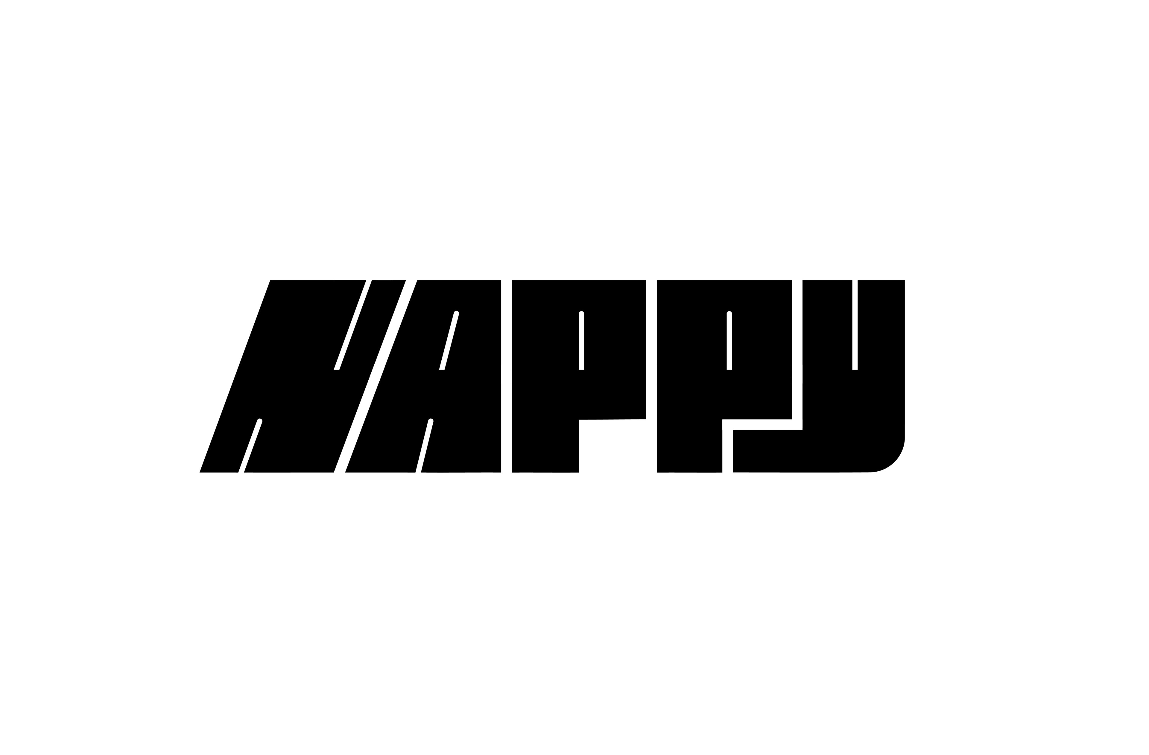
The final mark is intentionally bold to reflect my powerful, intense, empowering feeling. The boldness and intentional density of the letters also reflects the tightness of perhaps an afro or a tight curl pattern. The kink in the letter "Y" reflects the idea of the "kinks and coils" within natural hair. Overall, the essence of natural hair can be found in every part of the foundations of this word mark, without literally incorporating hair textures, etc. It's subtle, yet bold and confident.
FULL PROCESS GIF

PART TWO: PUBLICATION
The second part of this project entails continuing the message within the word mark and applying it to a full-blown publication with a cover, table of contents, feature article, and interview article. The publication had to be fully cohesive and have a set of rules that each and every page and article followed, while still standing out strongly on their own.
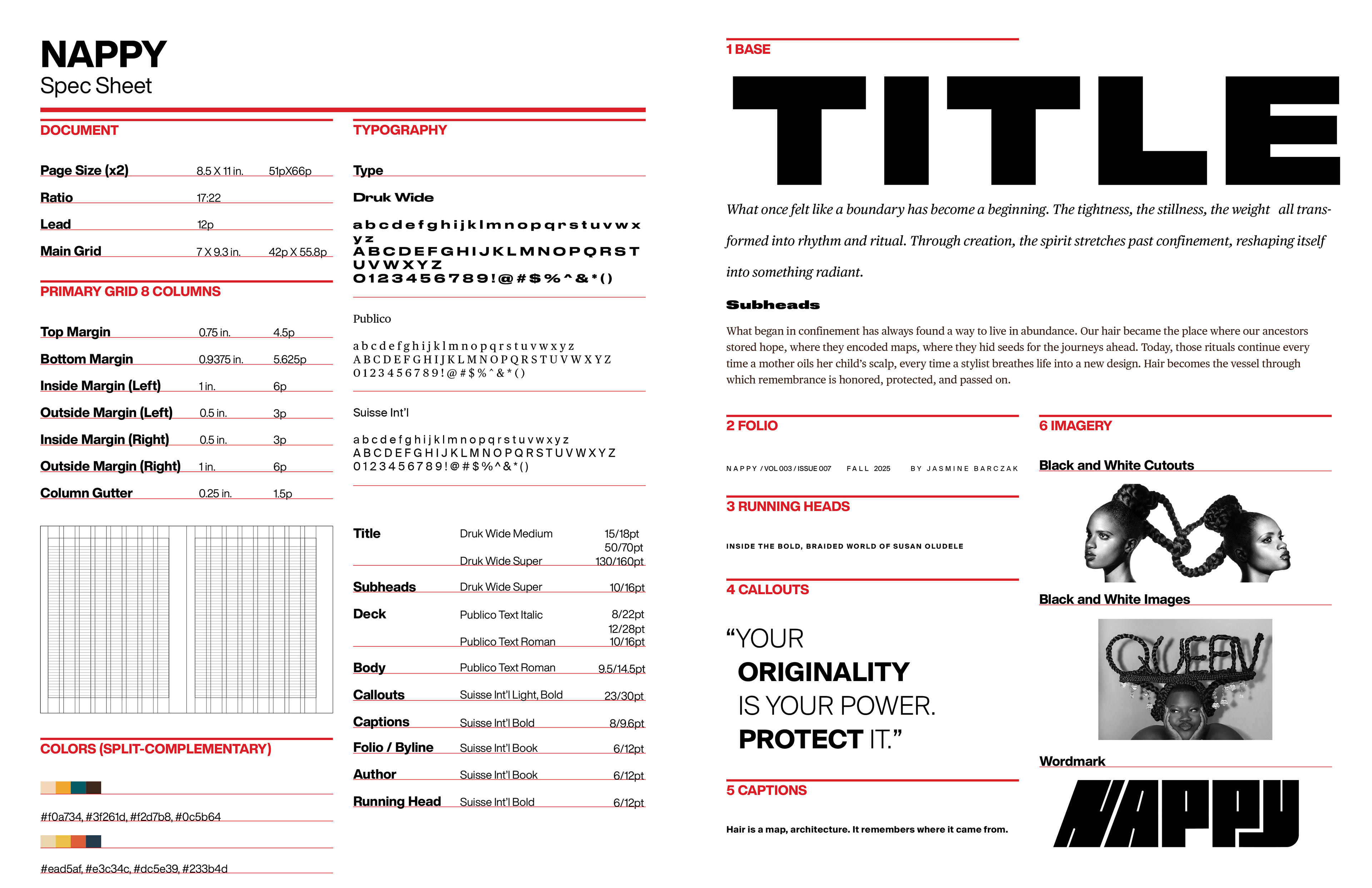
TYPOGRAPHY PAIRINGS
The typography was very carefully chosen for this publication. Druk Wide Bold was chosen for its boldness and natural texture, very much reflecting traits of natural hair itself. Publico Text Roman was chosen to add a sense of elegance and luxury to the publication, establishing that what once was something to be ashamed of is now beautiful and luxurious. Suisse Int'l Light was chosen to add even more texture to the page, reflecting the sheer amount of different curl patterns within natural hair. All together, these typefaces work beautifully to push the empowering, progressive, texturized message of my publication.
FRONT COVER CONCEPT EXPLORATION
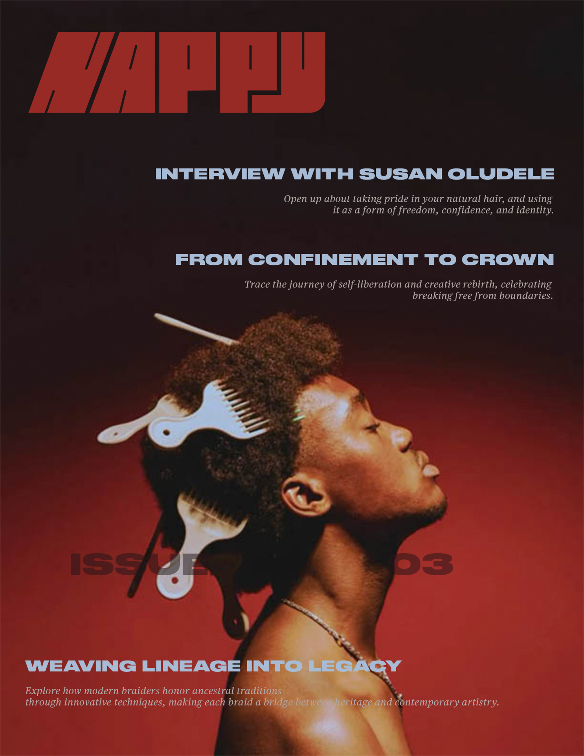
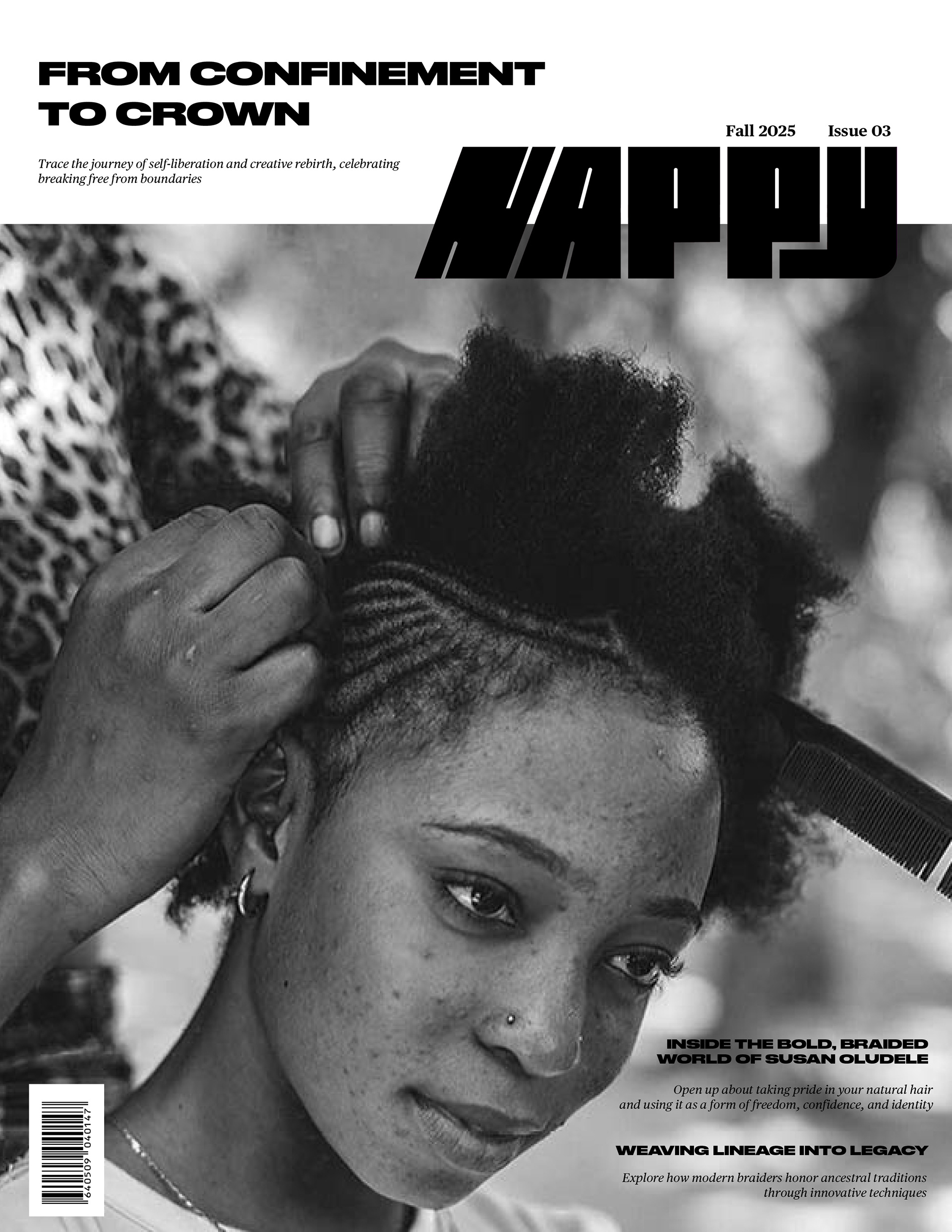
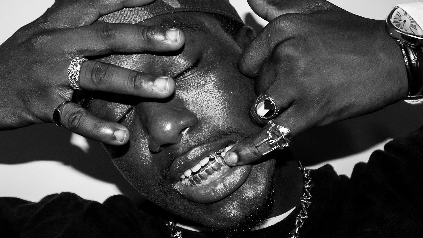
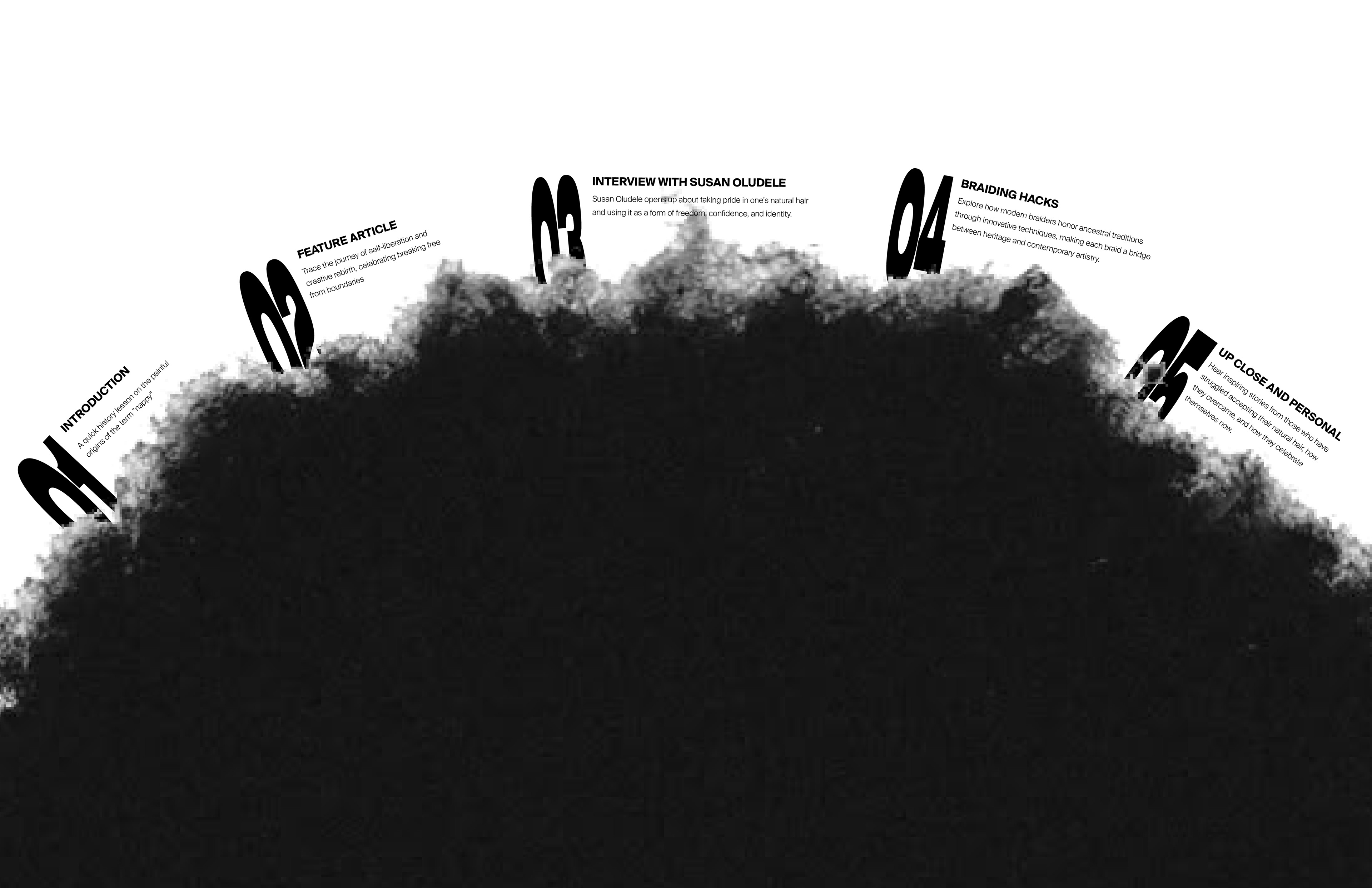
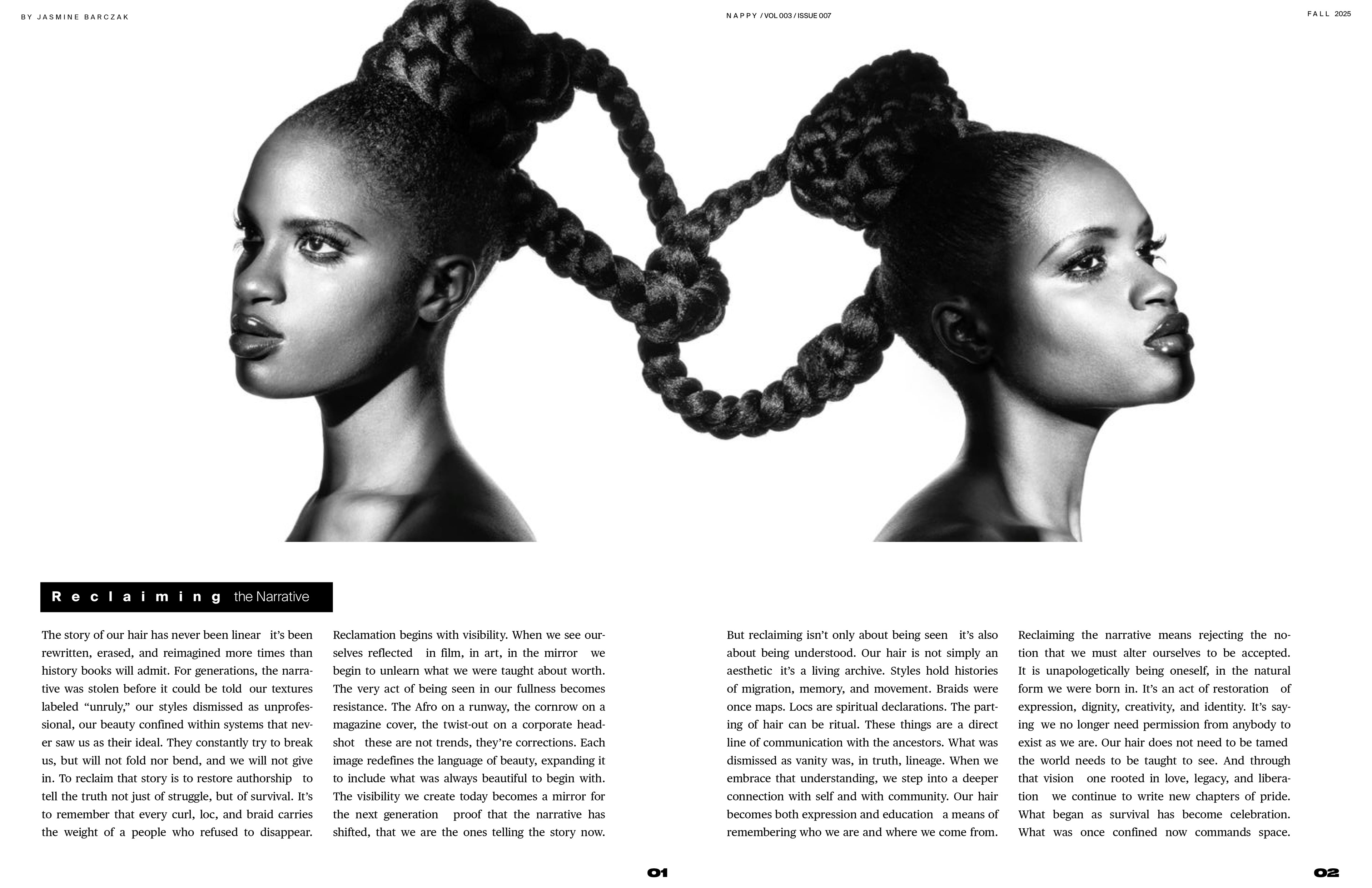
FINAL FRONT COVER
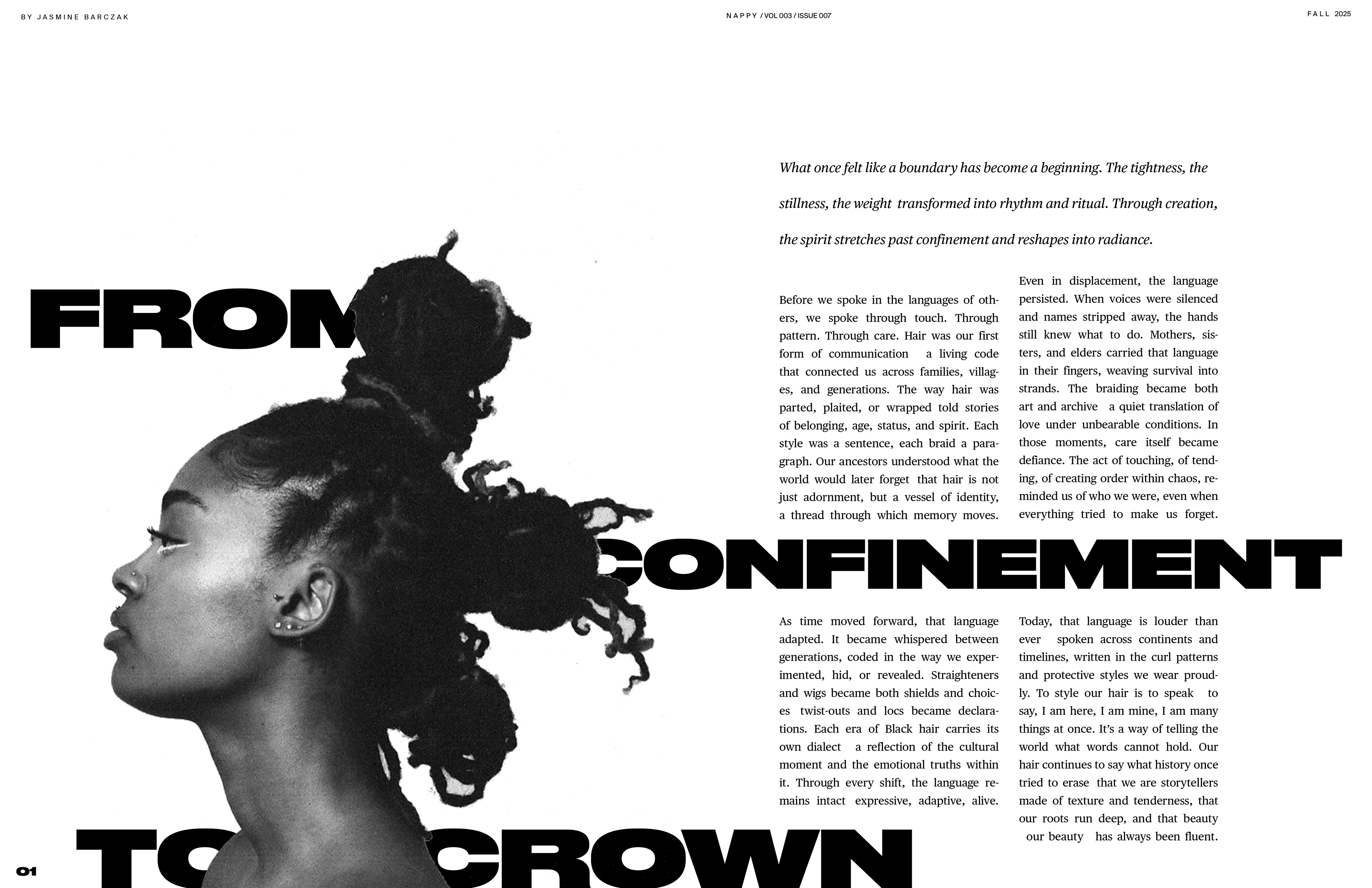
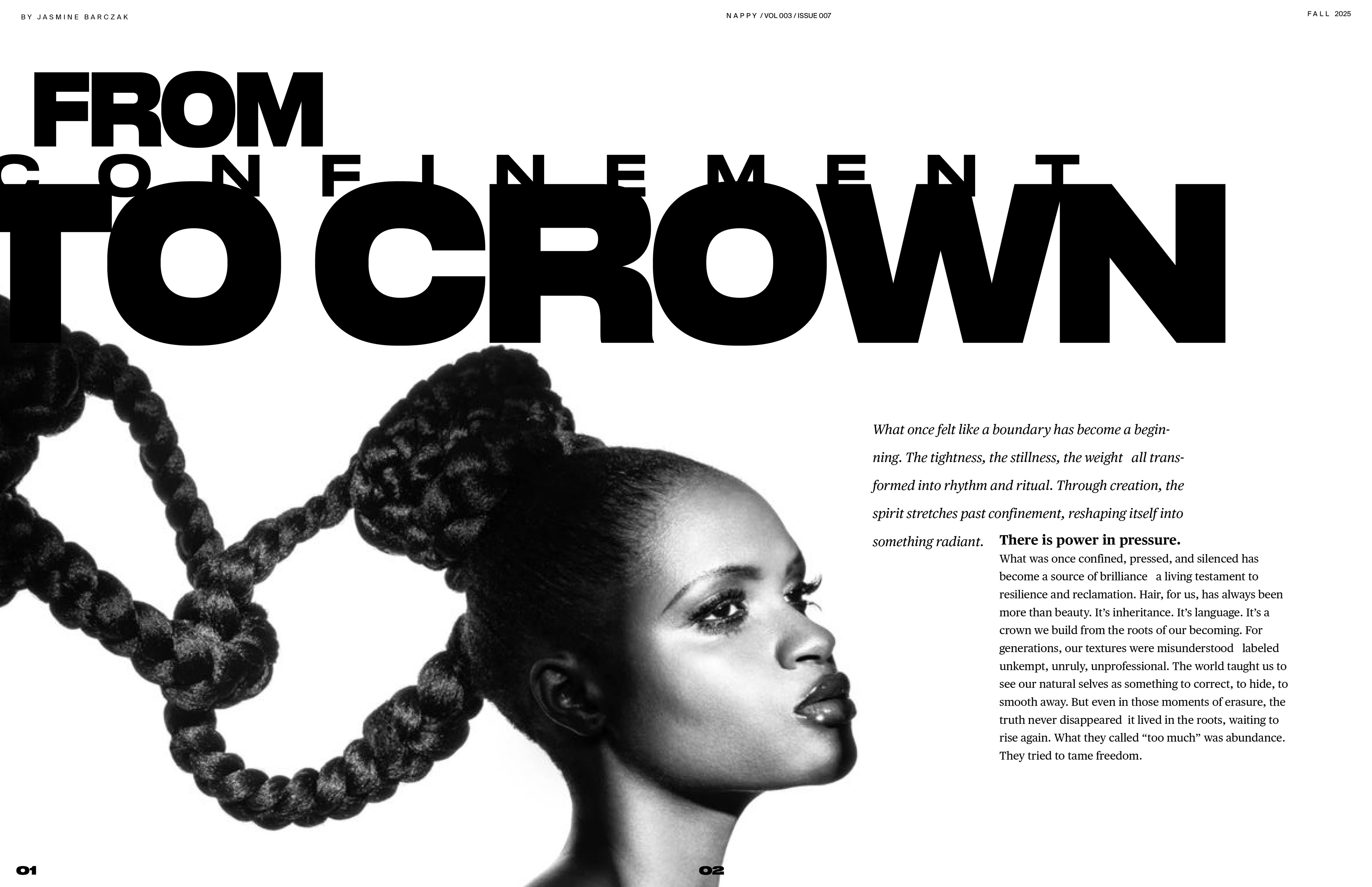
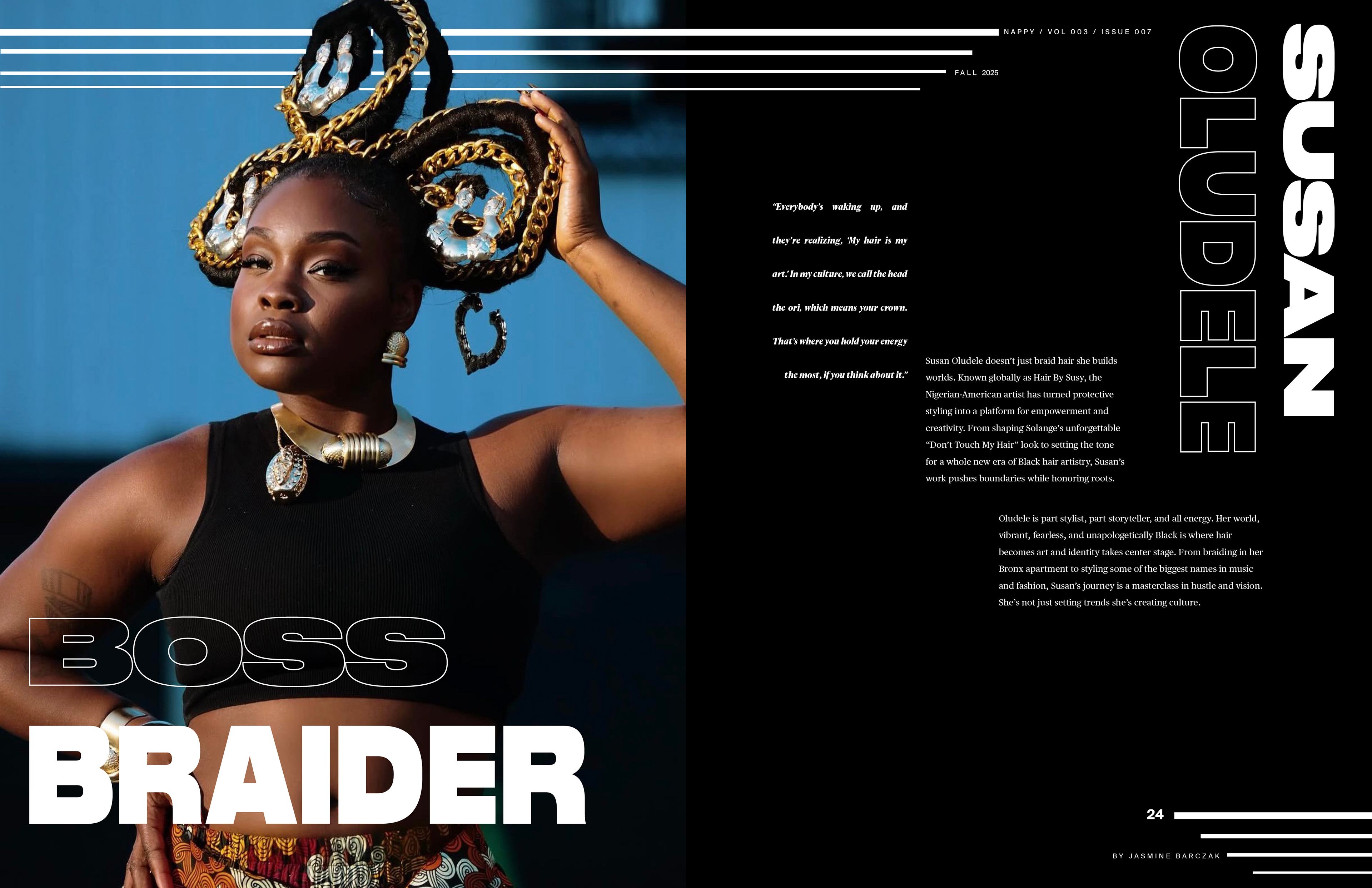
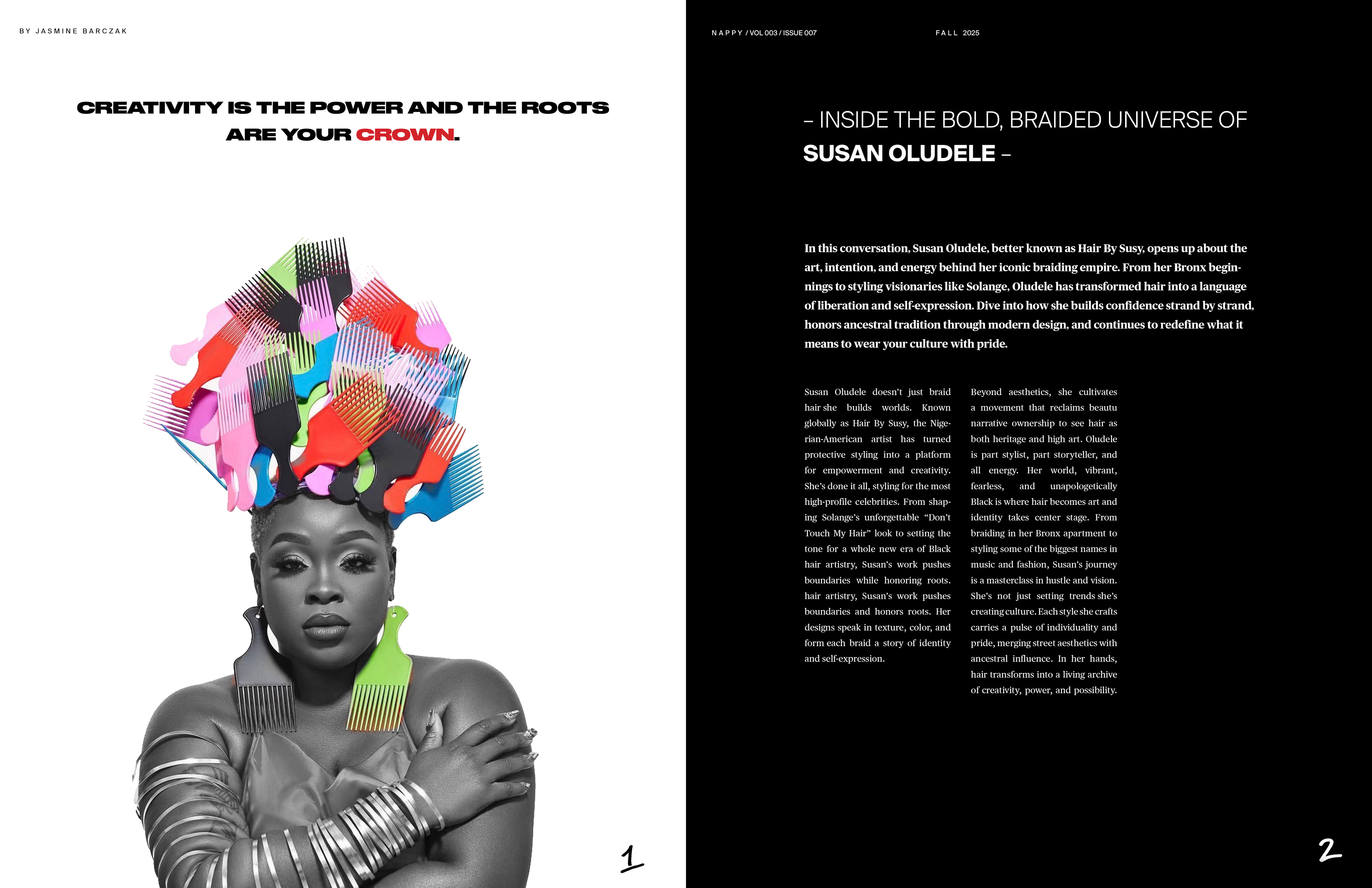
The final front cover was kept black and white for impact. The image itself is stunning and emotional, and black and white only emphasizes that. The featured articles seemingly break the boundaries that constrain the image, reflecting how natural hair is often restrained and put in a box, but this magazine breaks those restrains and reclaims it in a positive light.
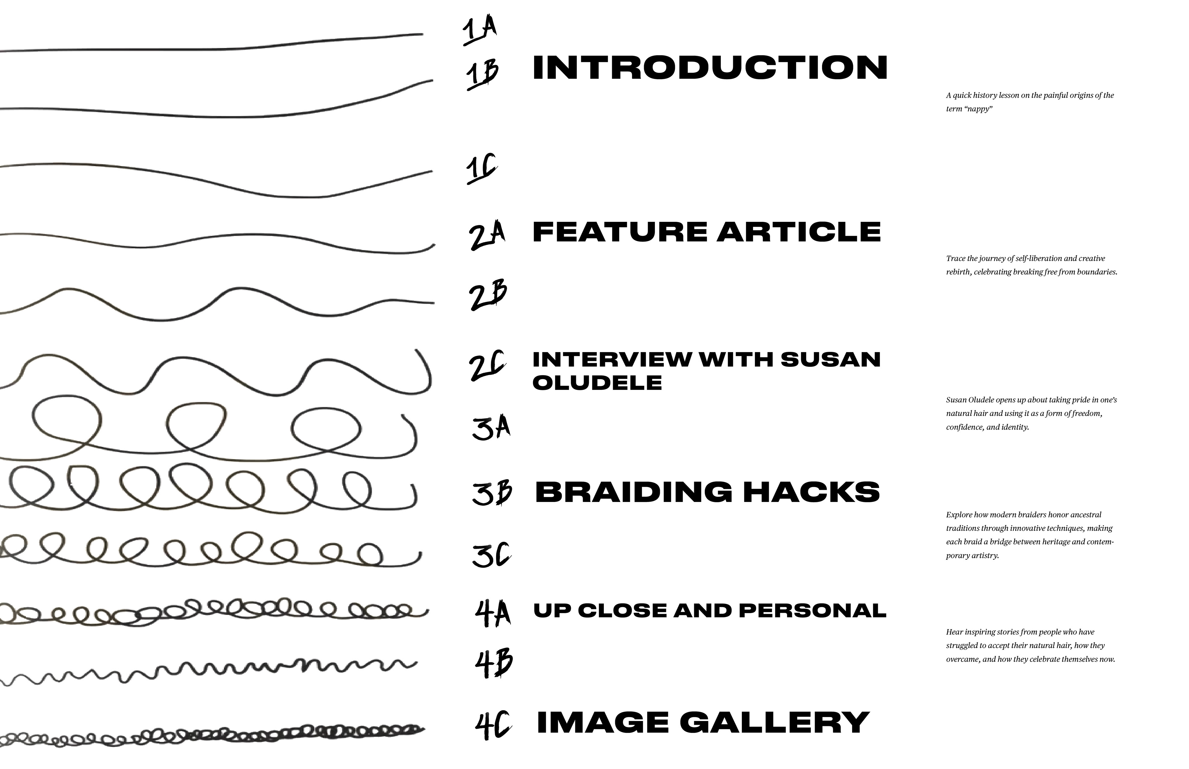
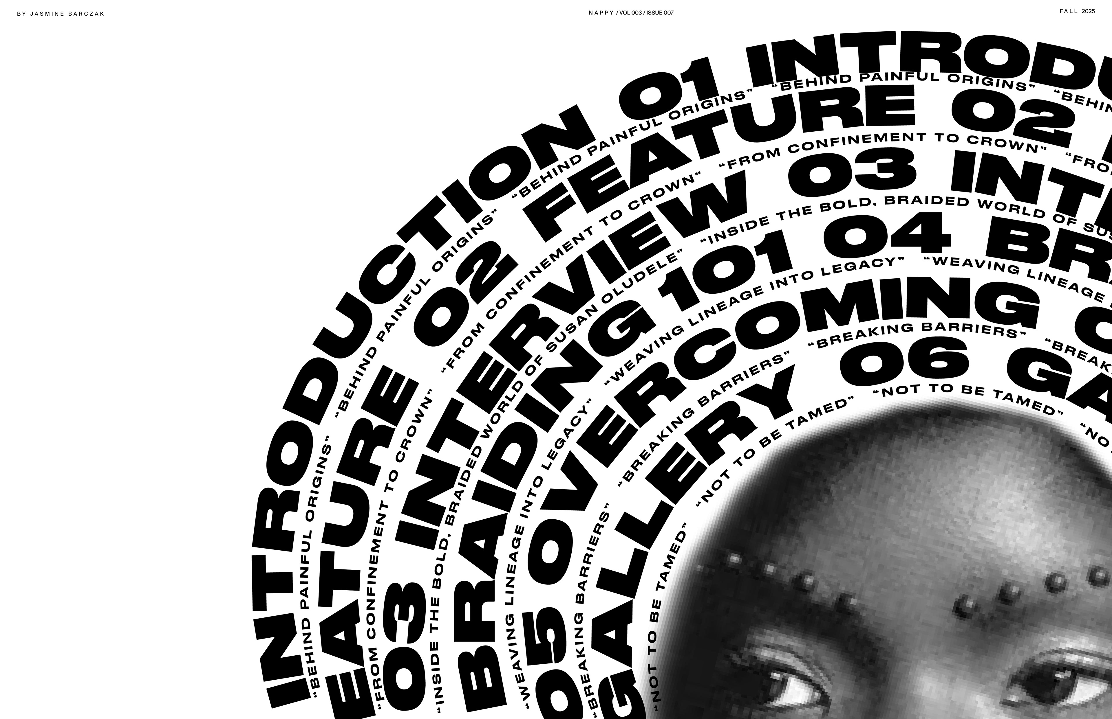
TABLE OF CONTENTS CONCEPT EXPLORATION
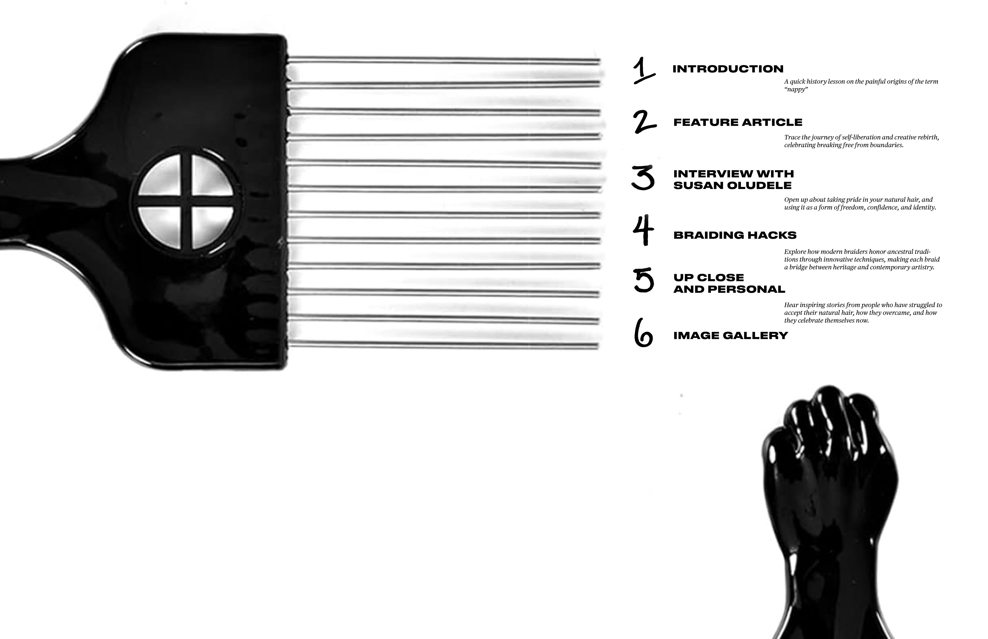
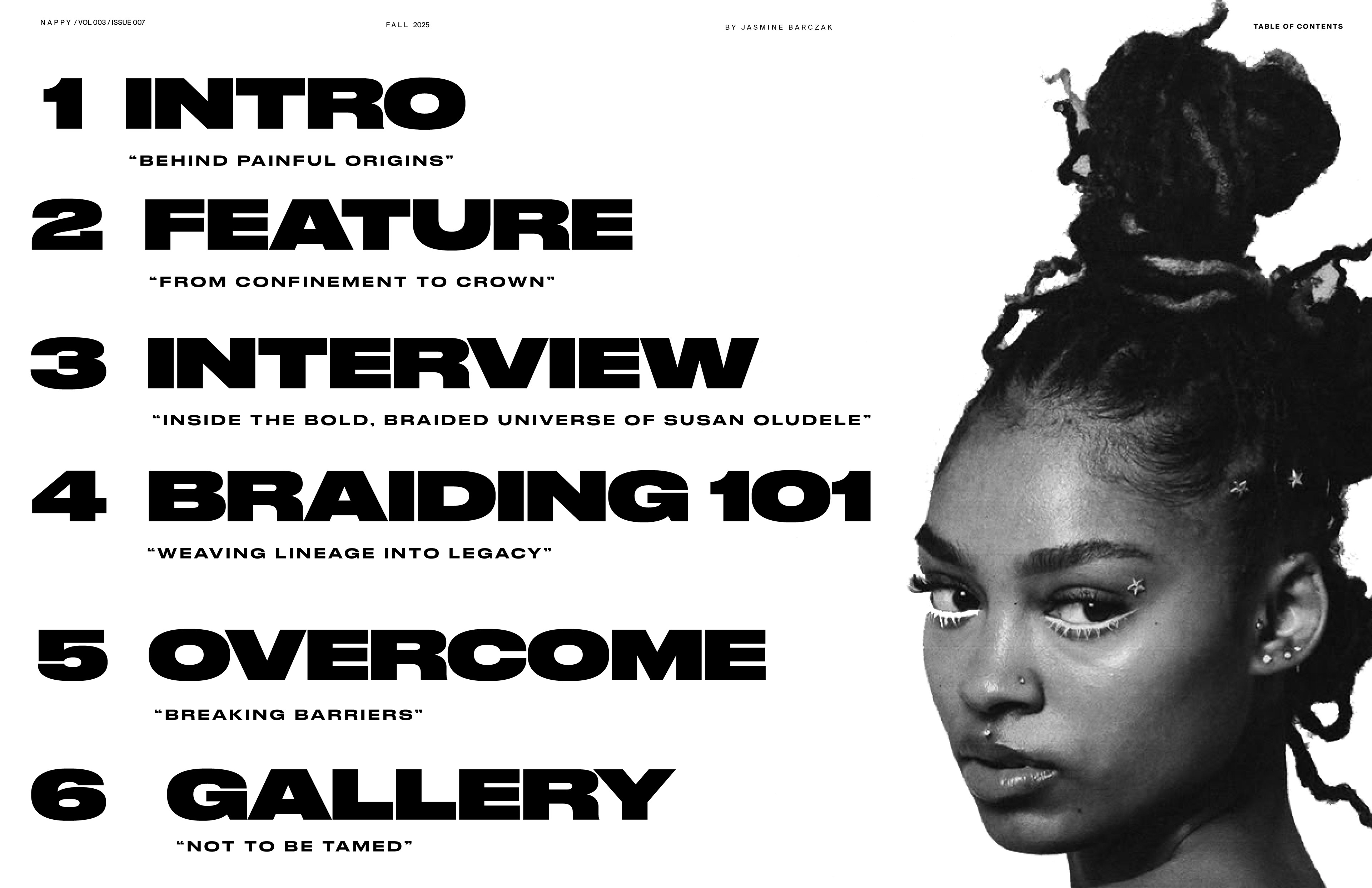
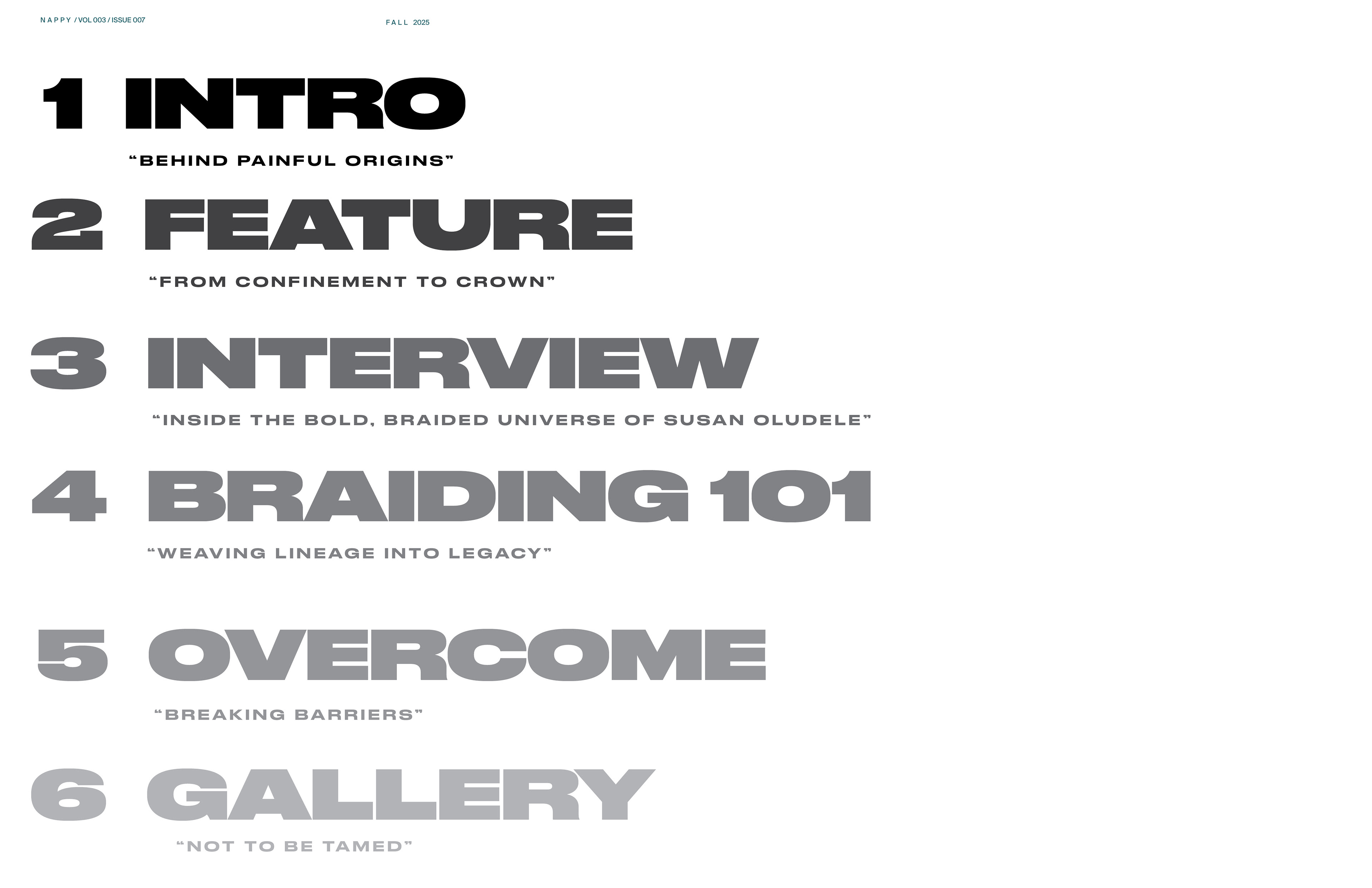
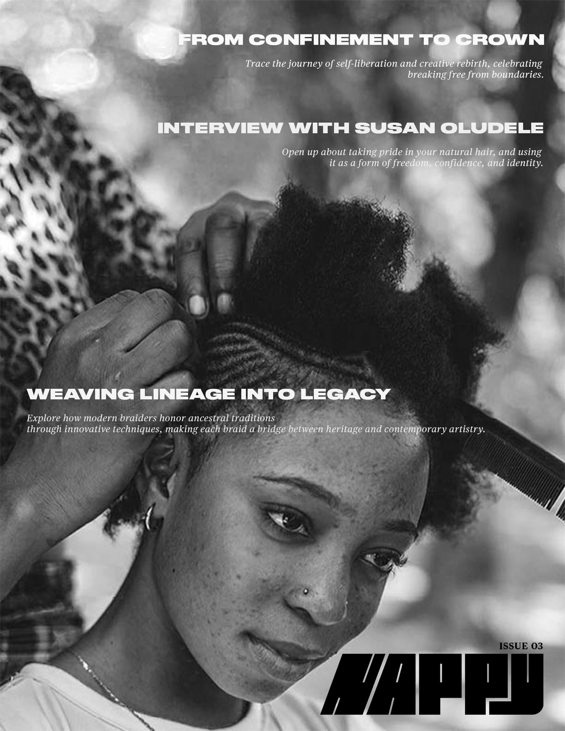
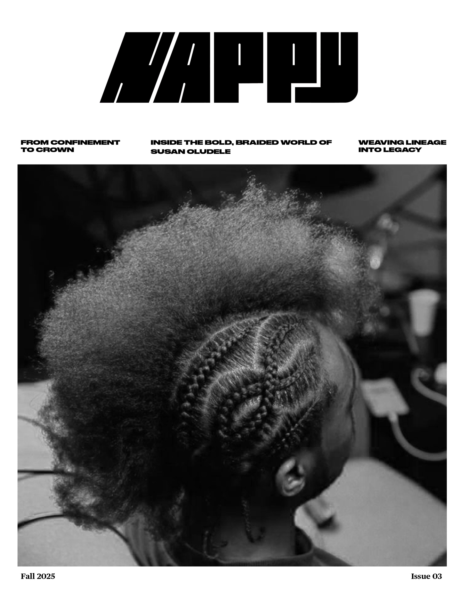
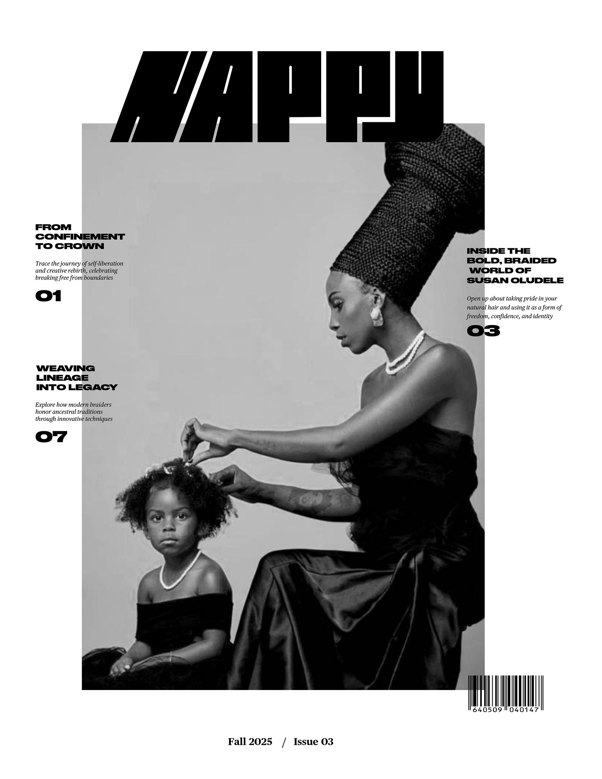
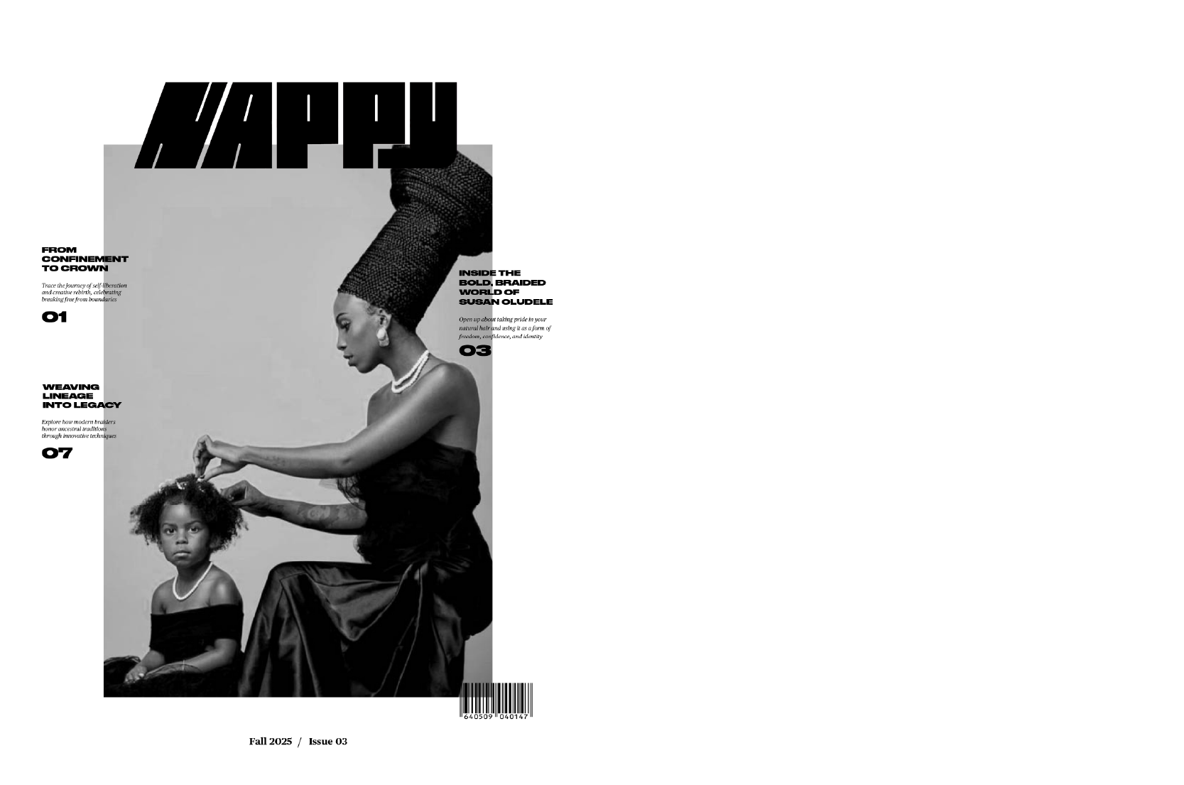
FINAL TABLE OF CONTENTS
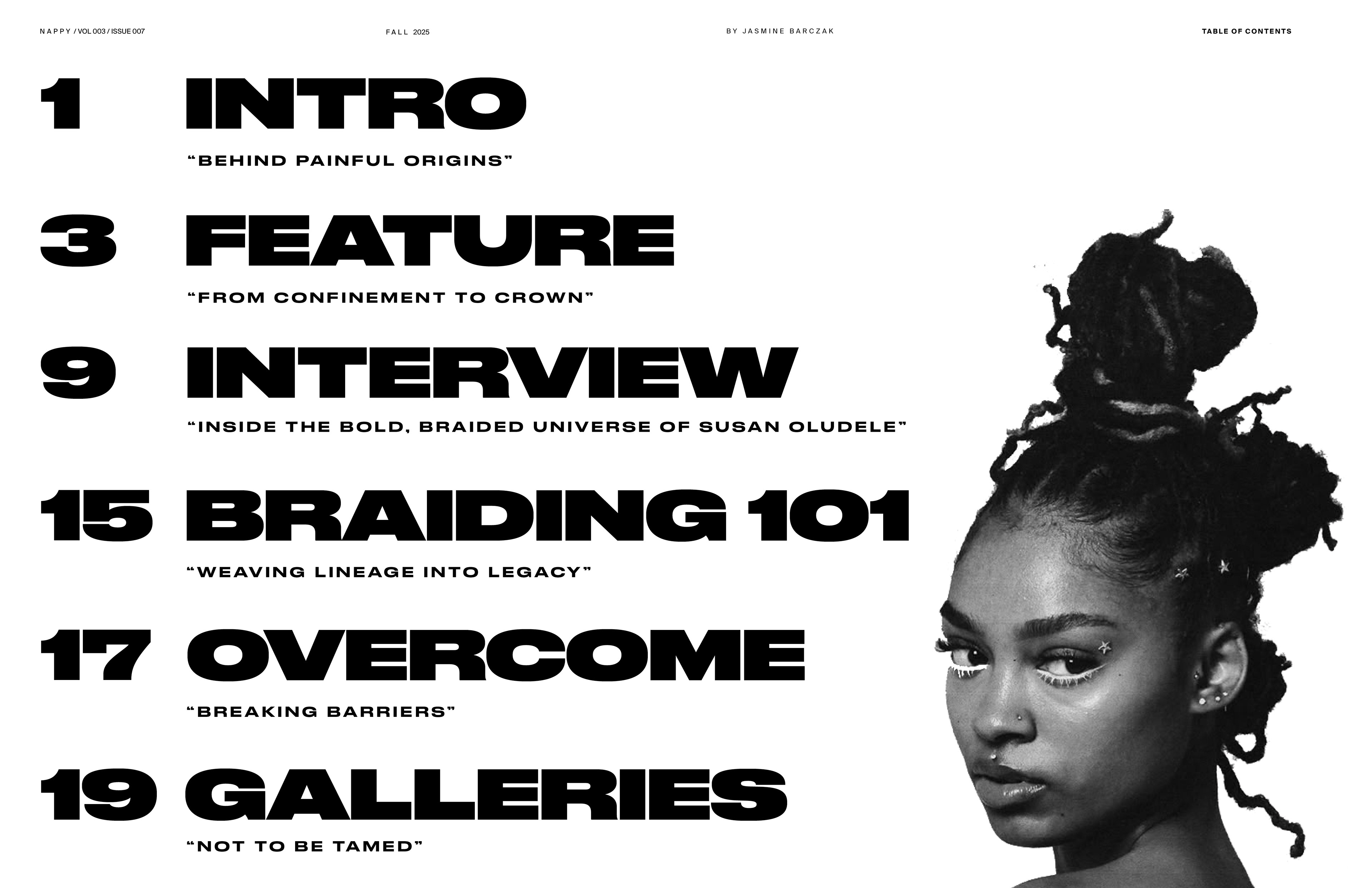
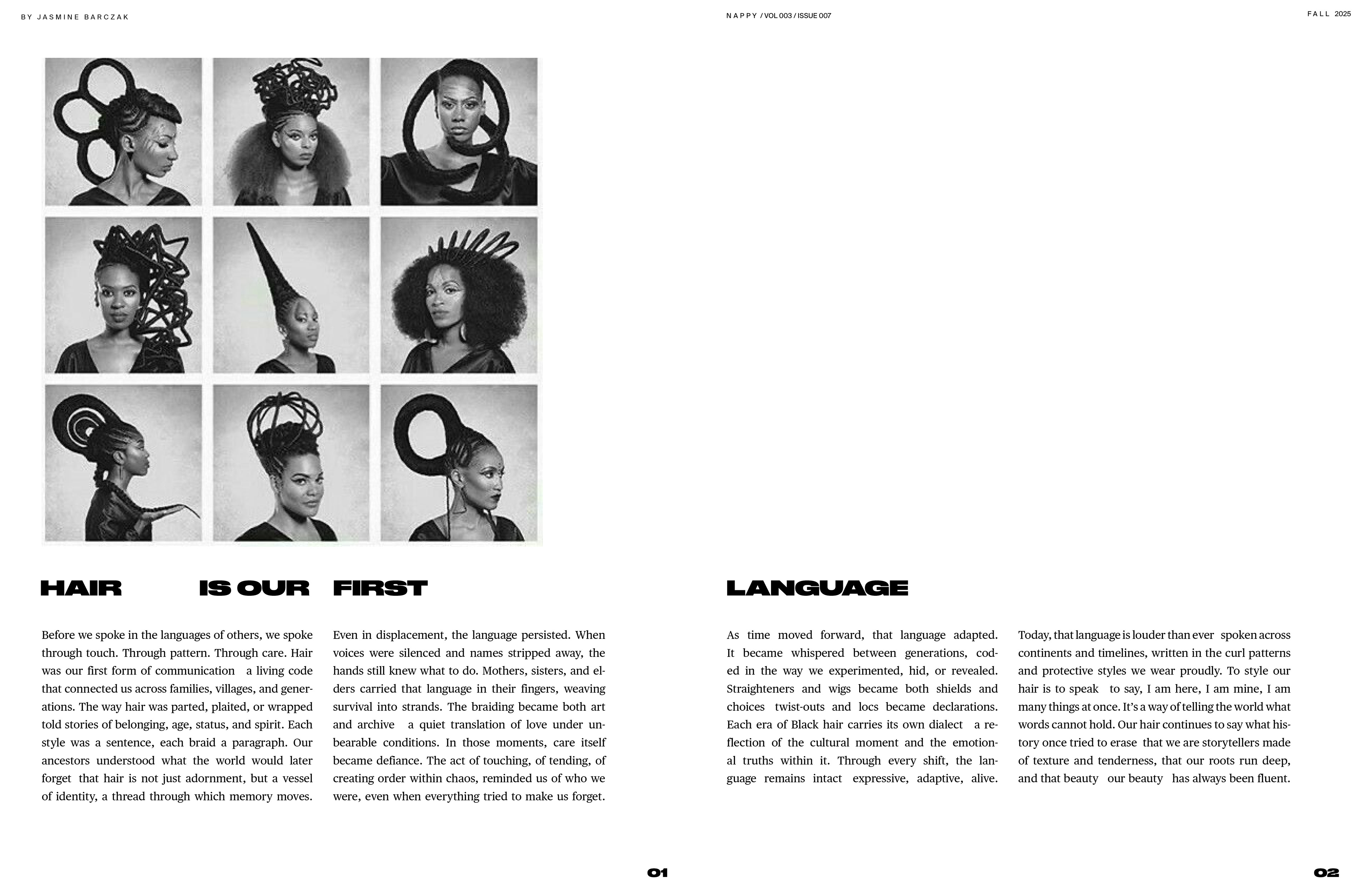
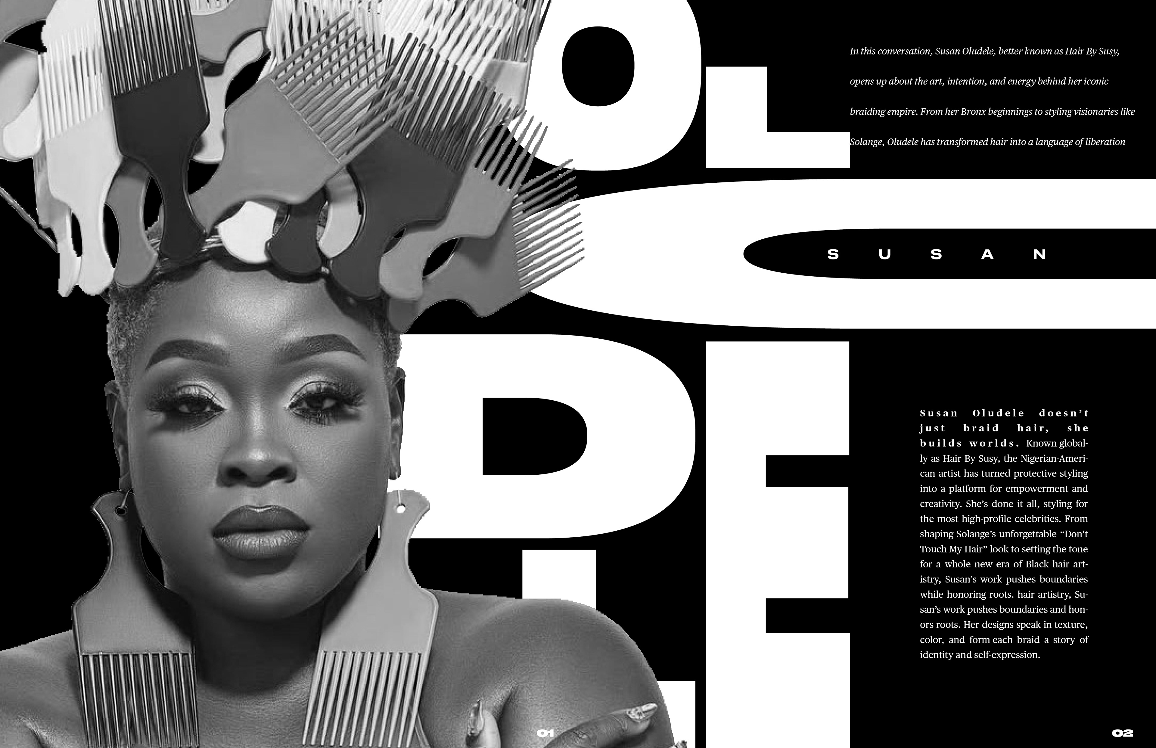
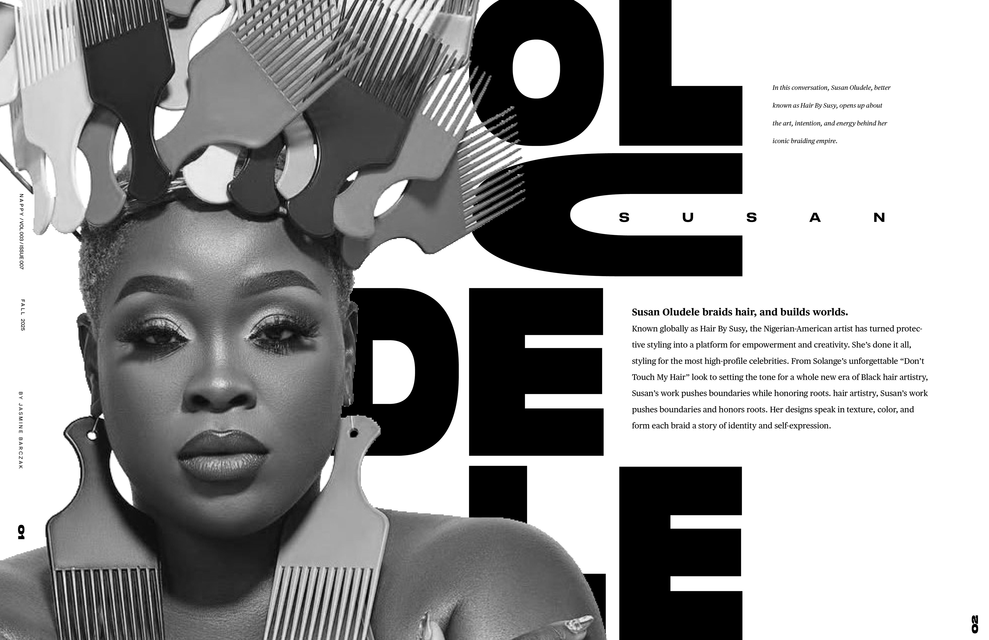
The final table of contents is a bold, loud, powerful introduction to the rest of the publication. Everything about it screams rebellion, from the bold, large typefaces to the image itself that features a stunning, bold hairstyle. It sets the tone for the rest of the publication.
FEATURE ARTICLE CONCEPT EXPLORATION
COLOR STUDIES
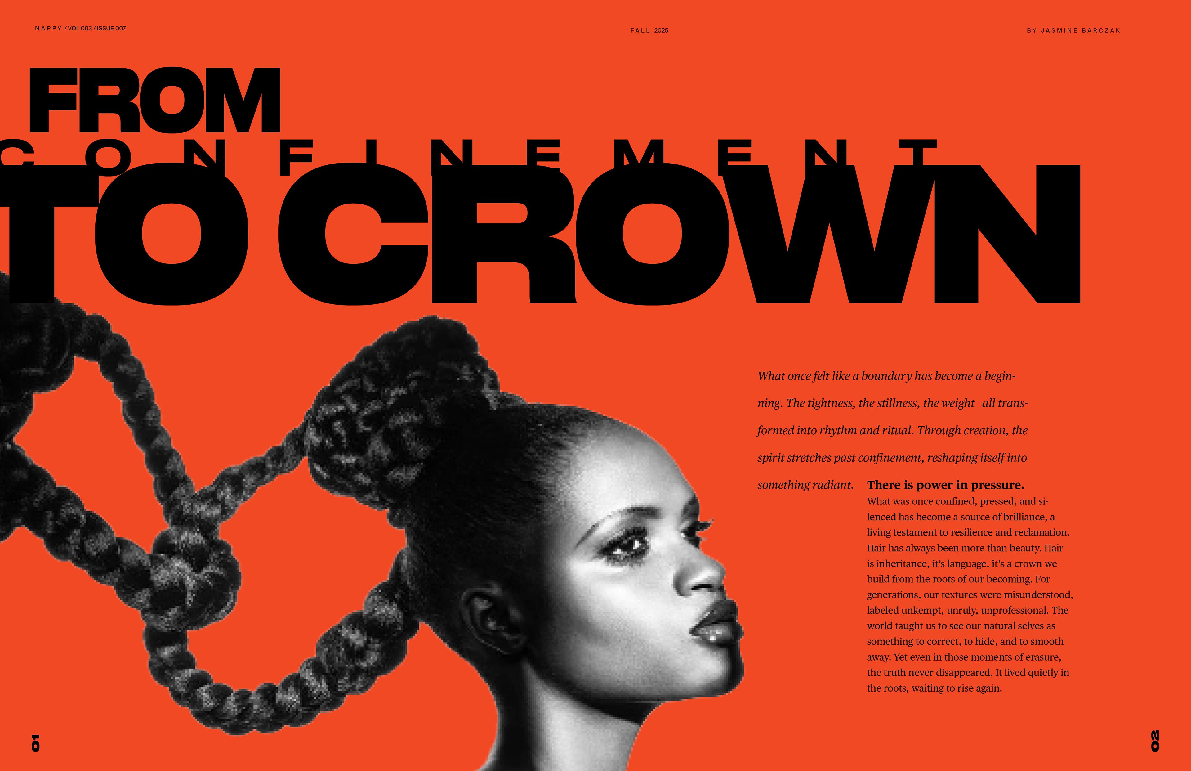
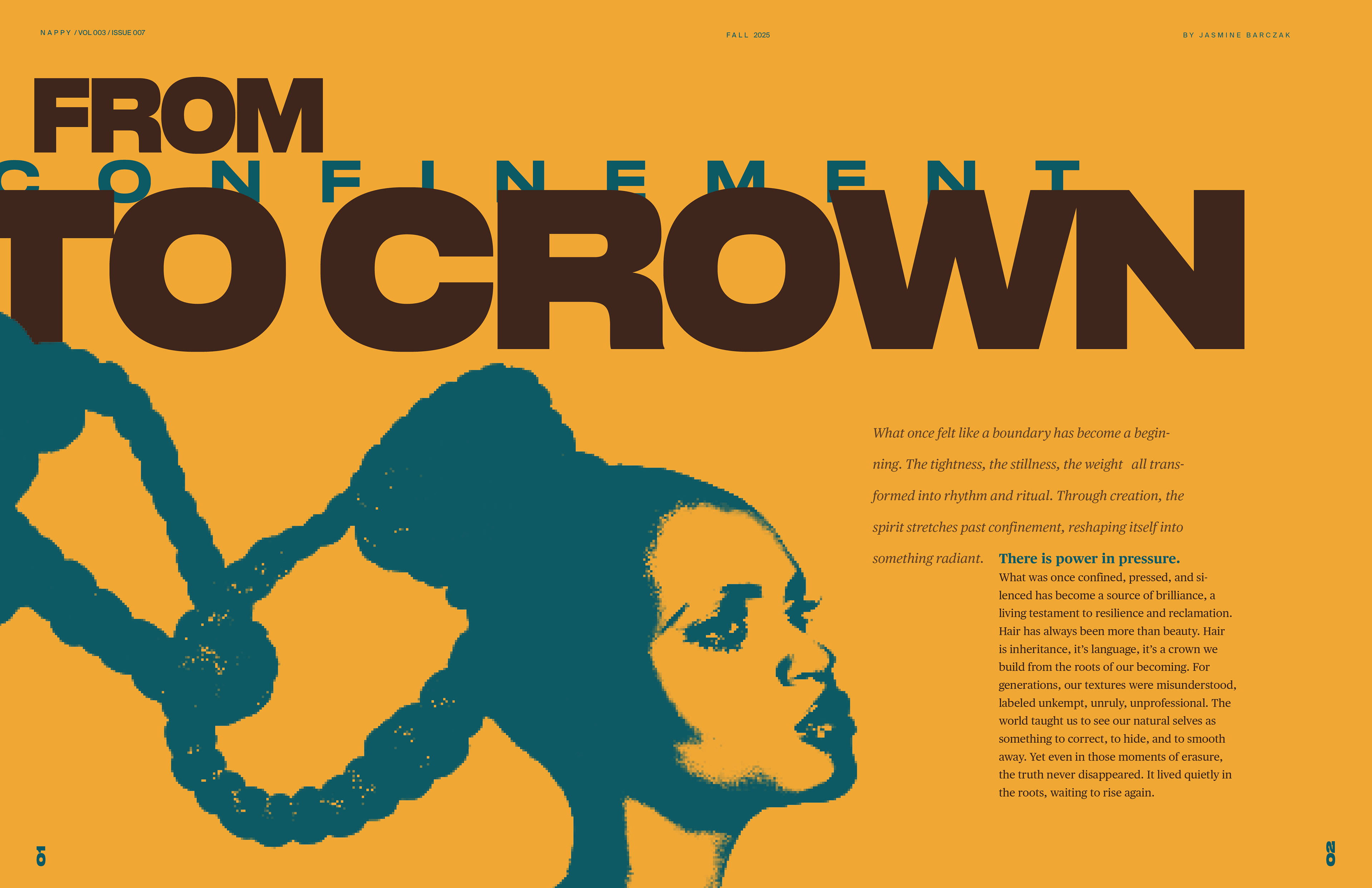
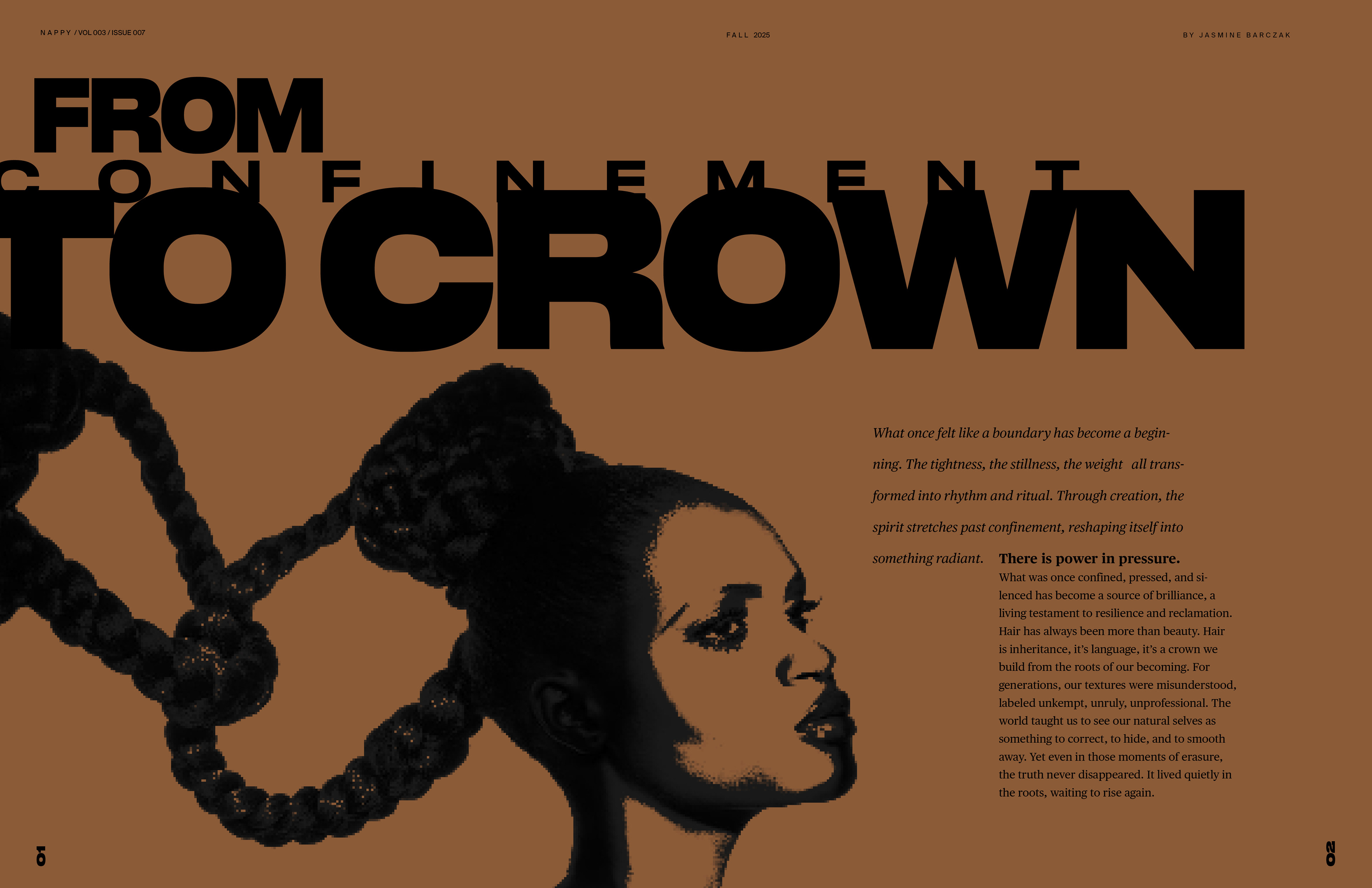
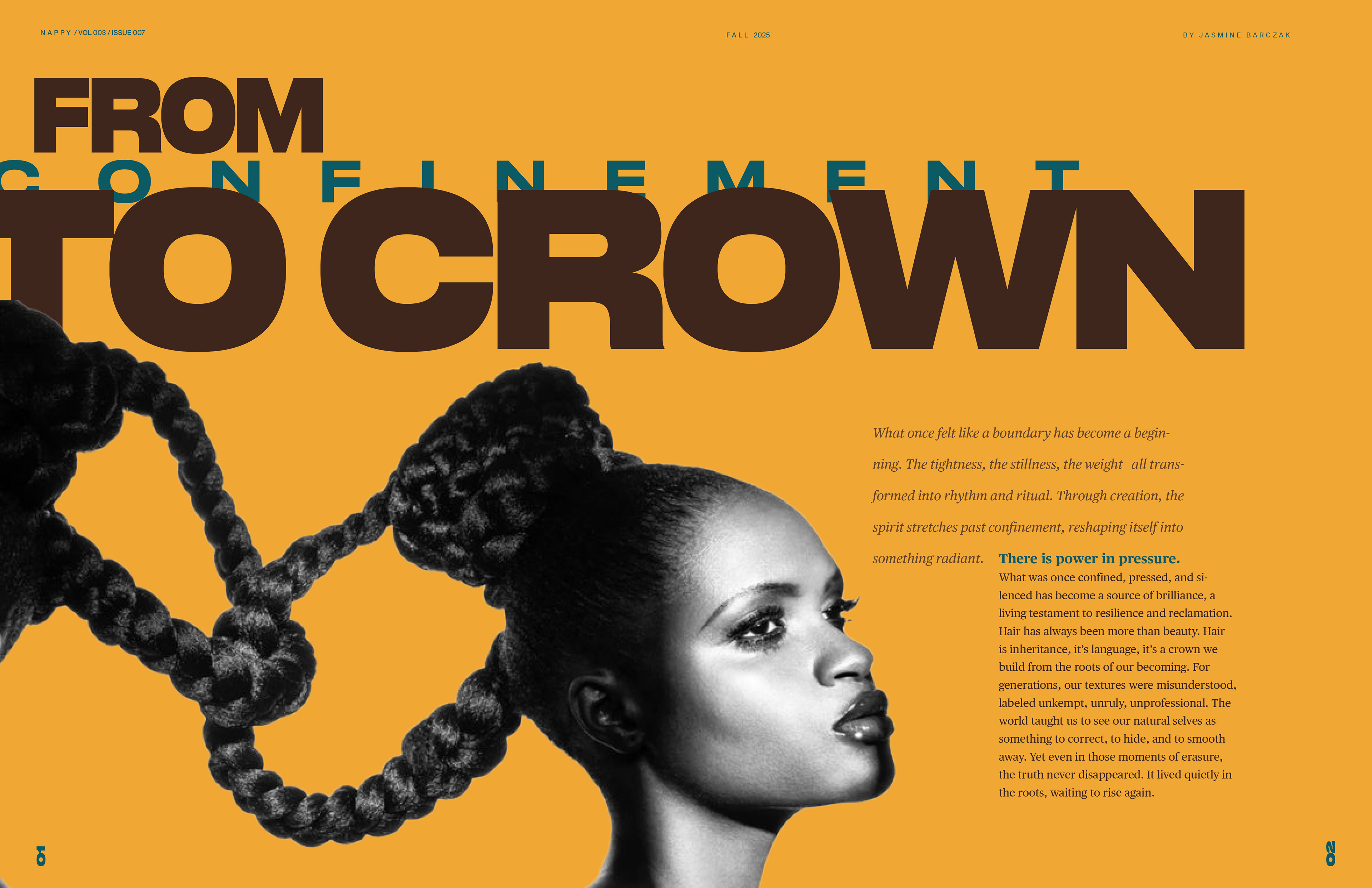
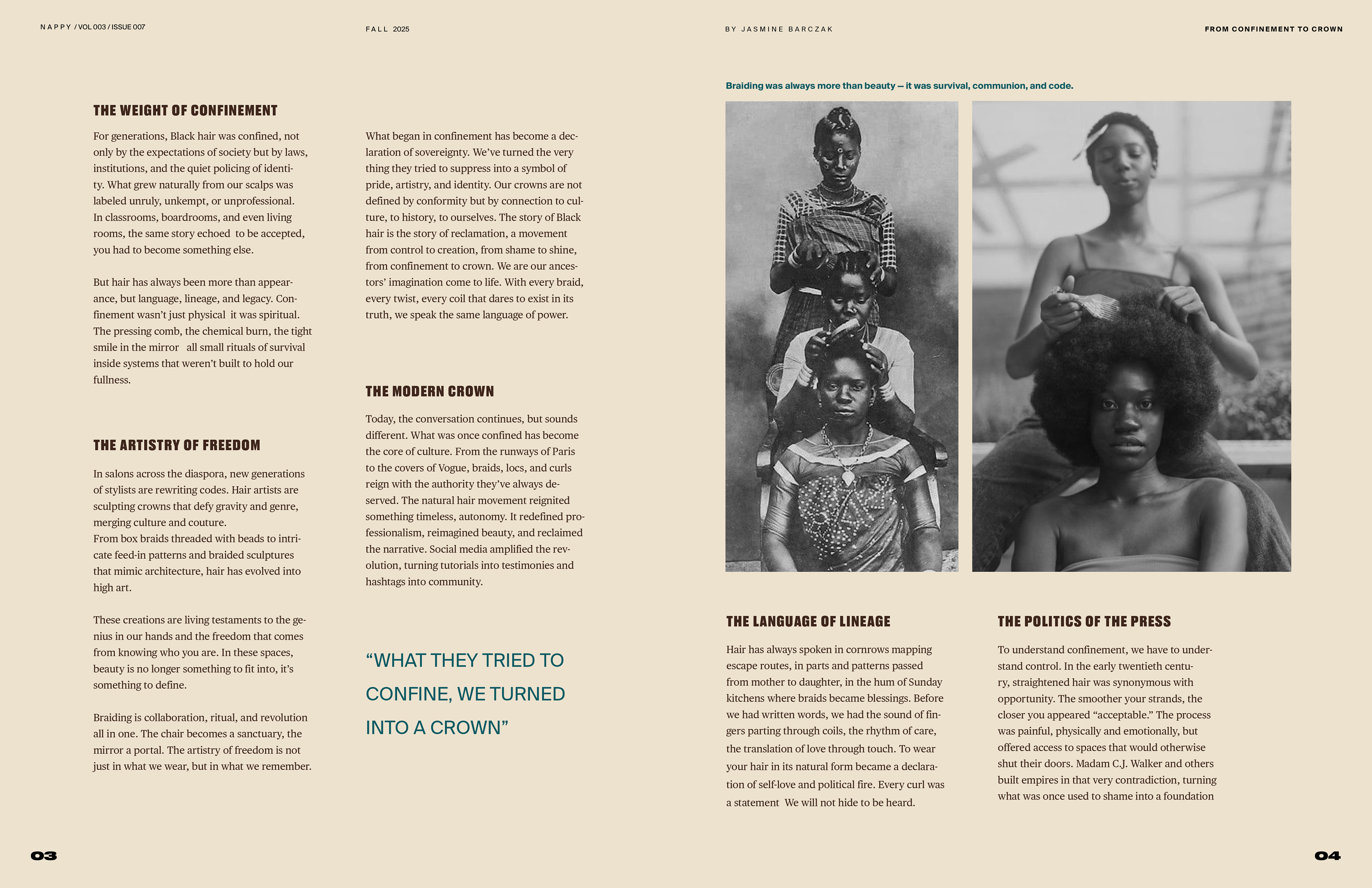
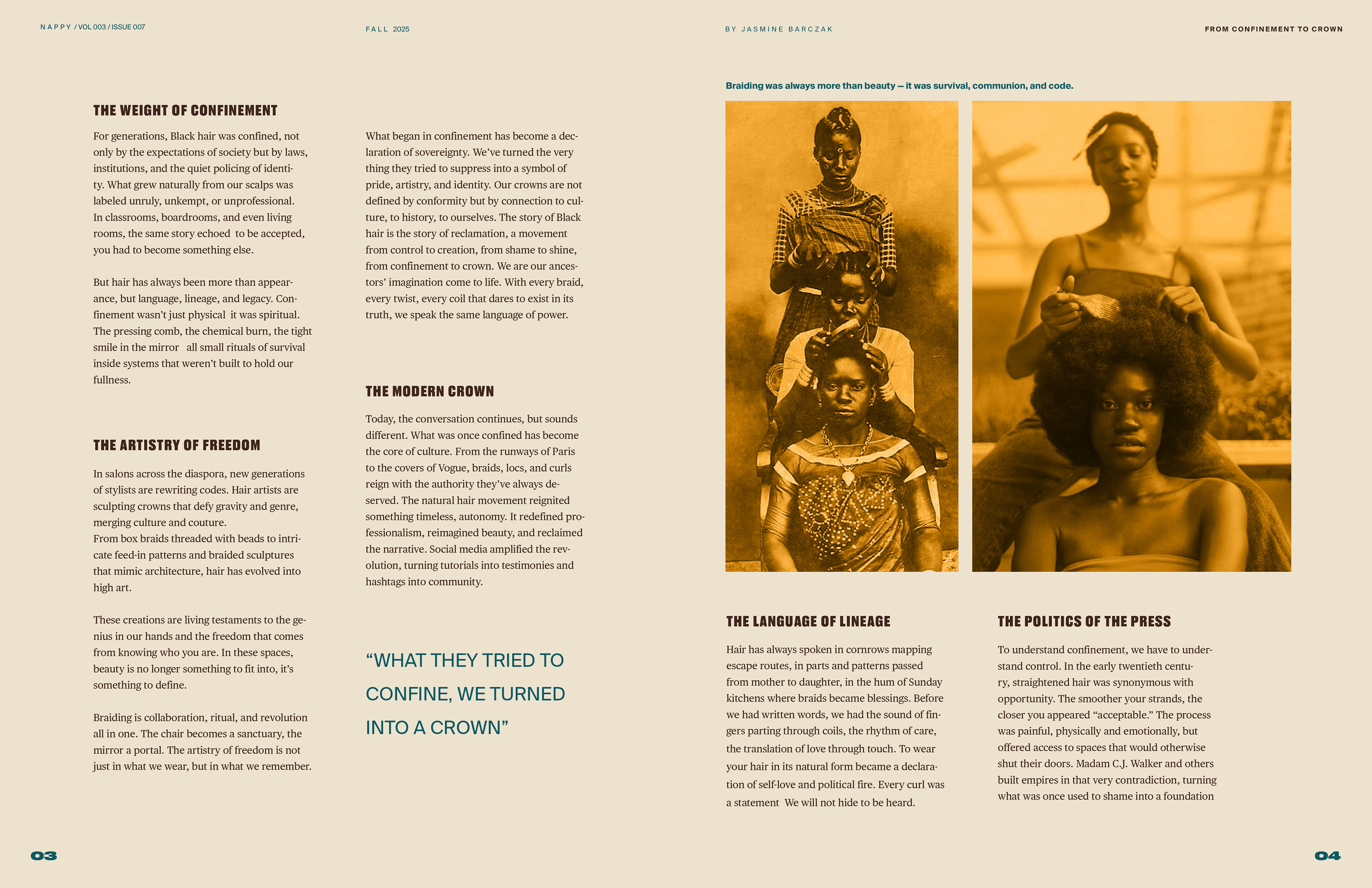
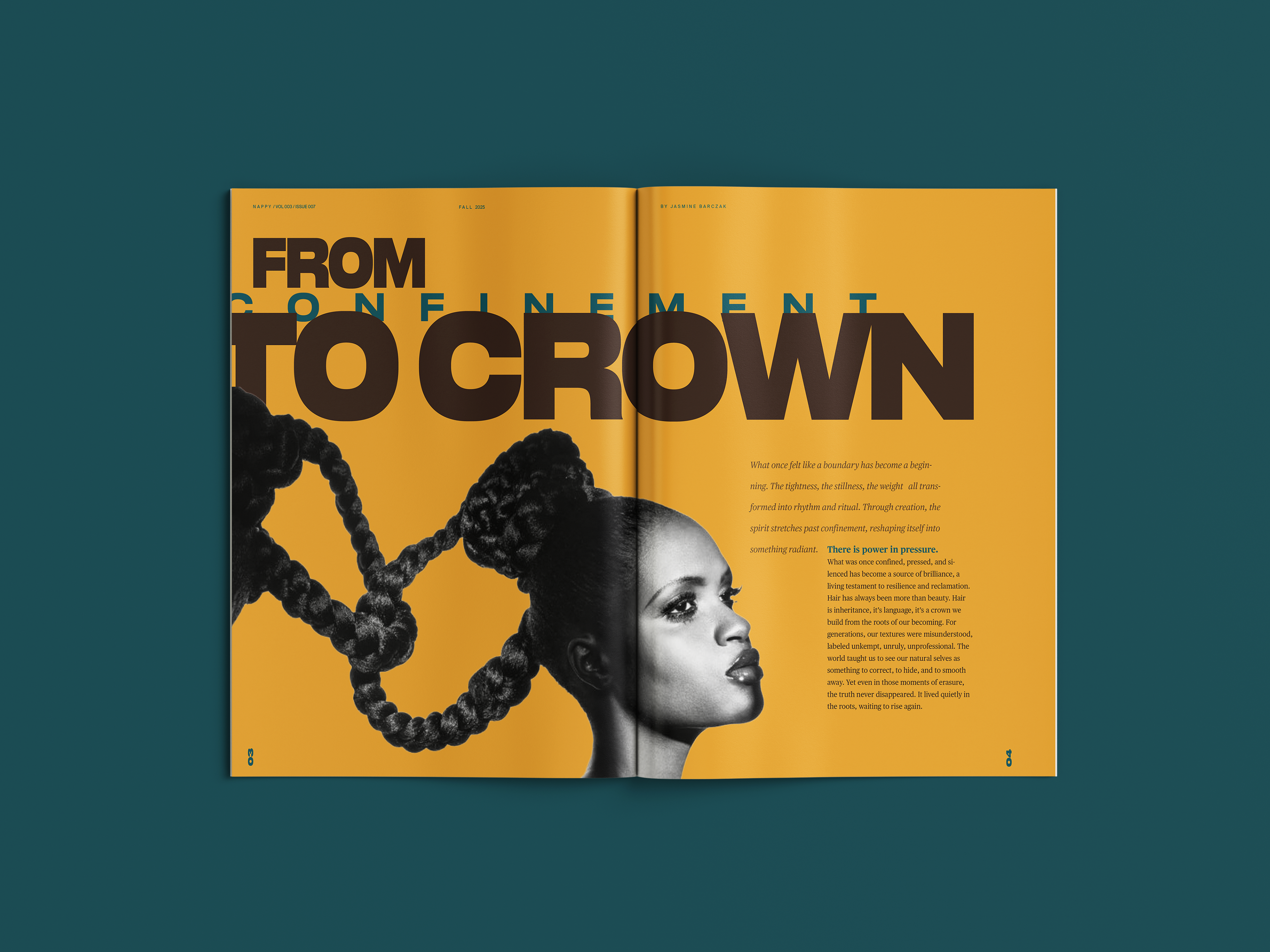
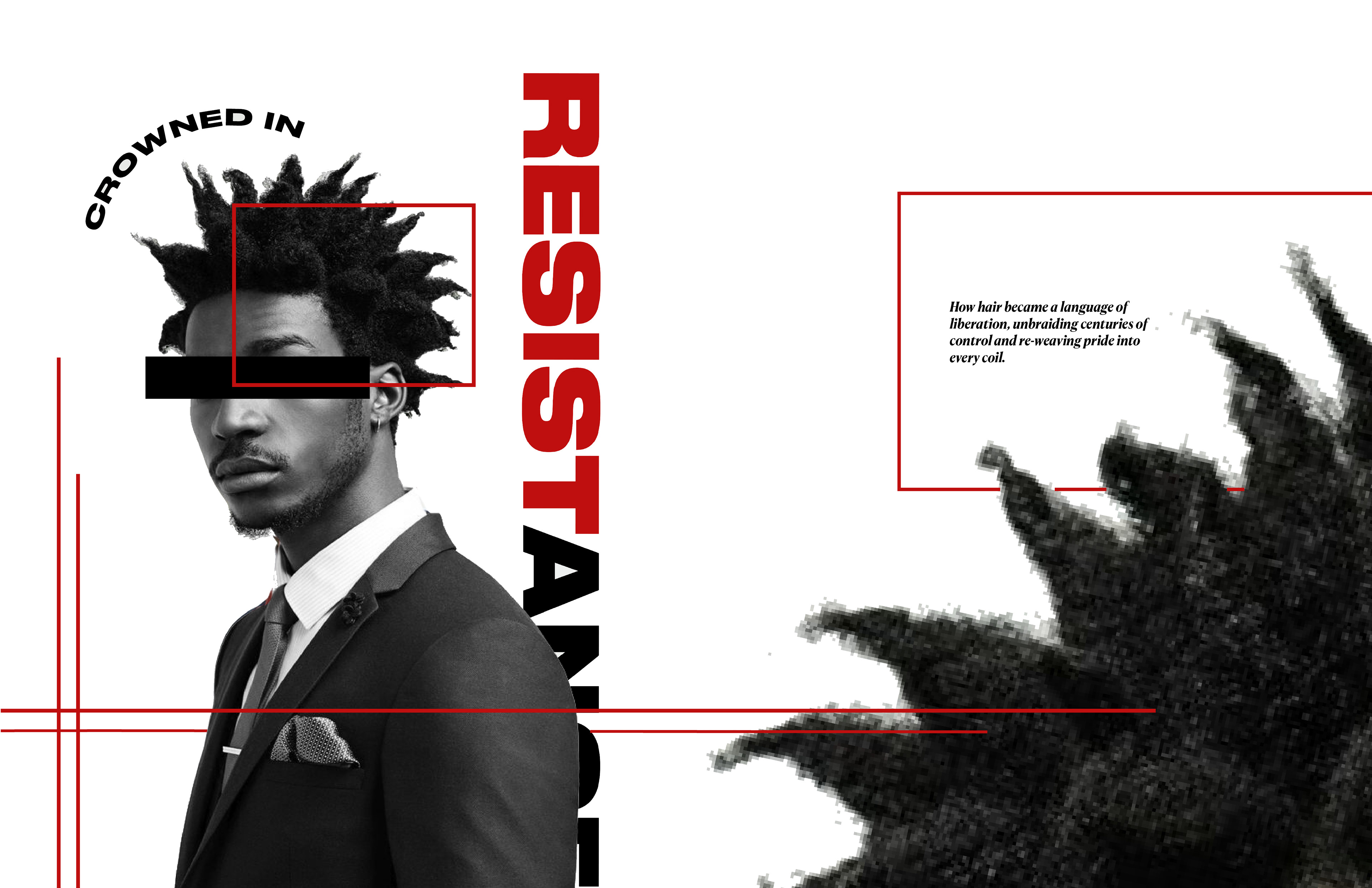
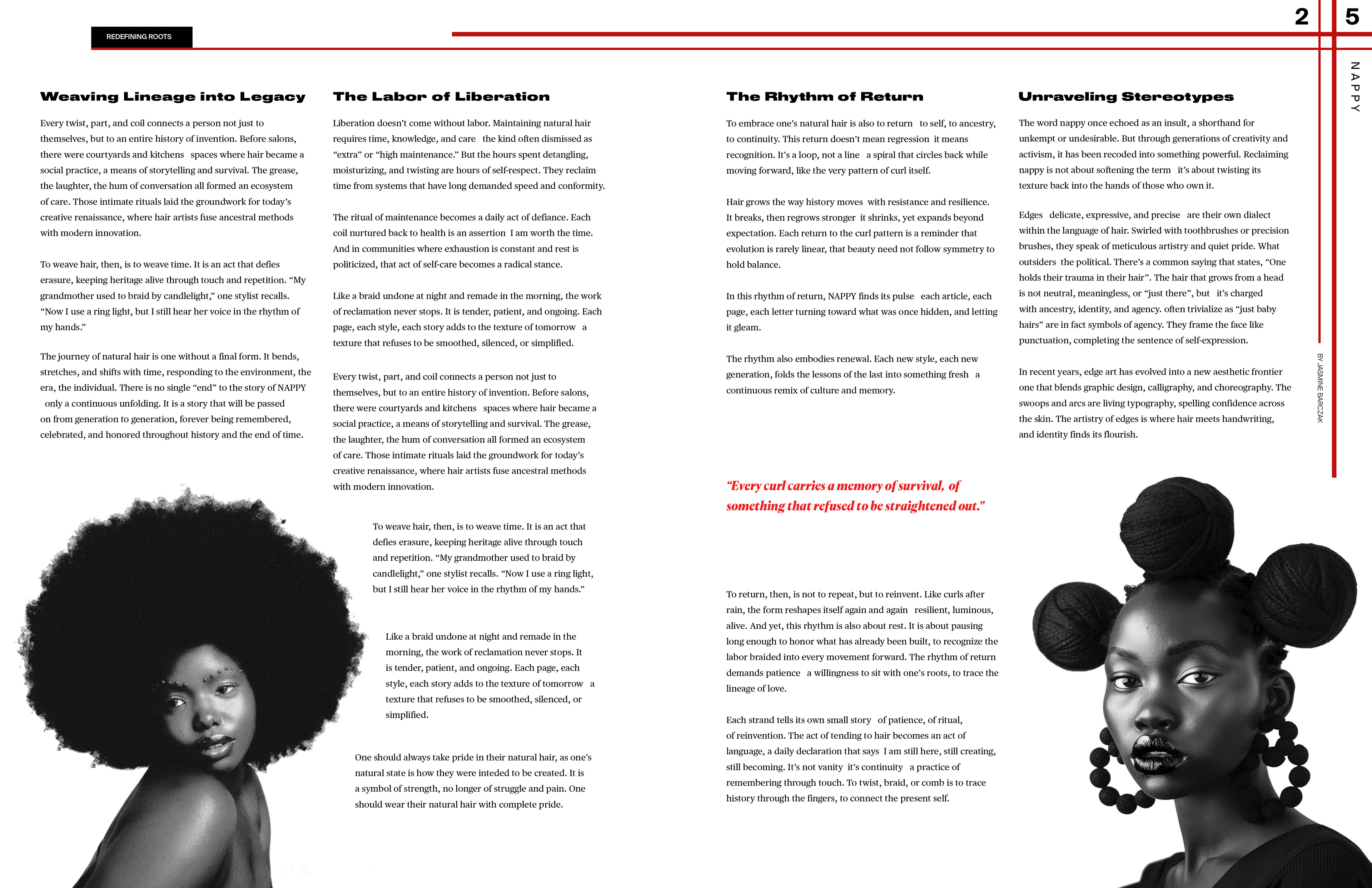
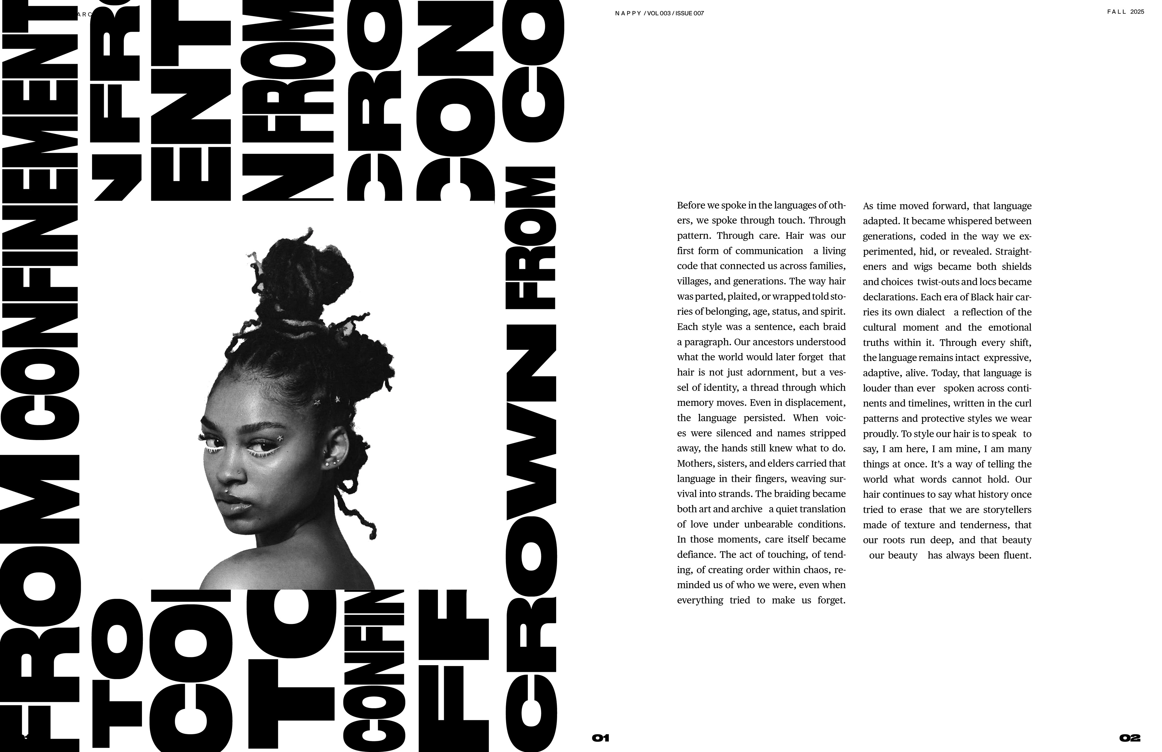
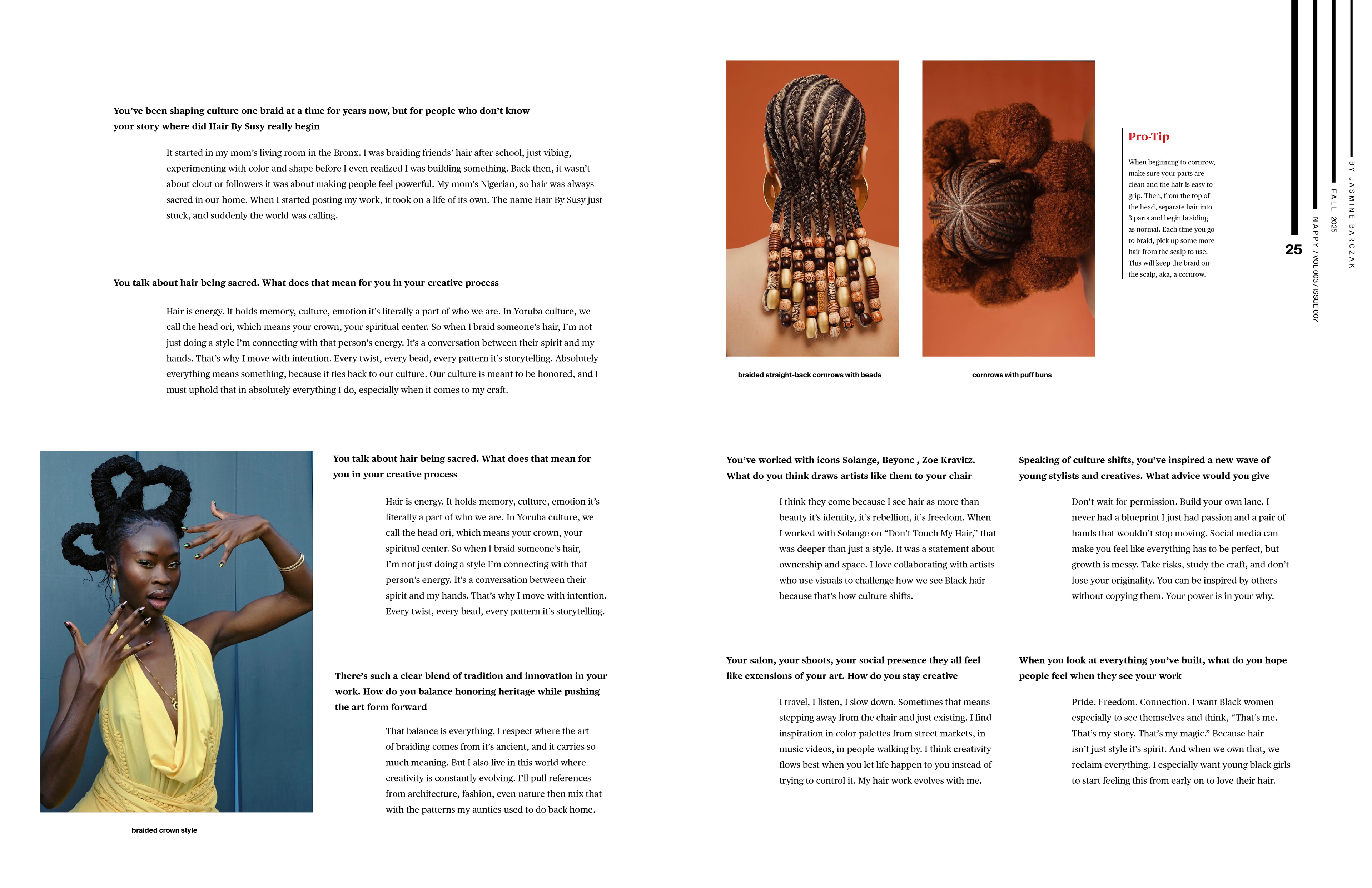
FINAL FEATURE ARTICLE
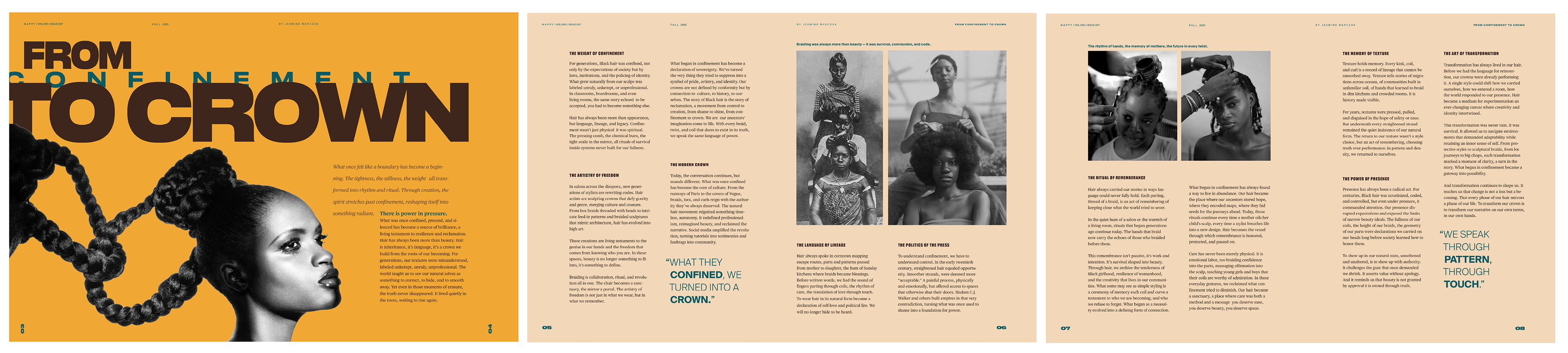
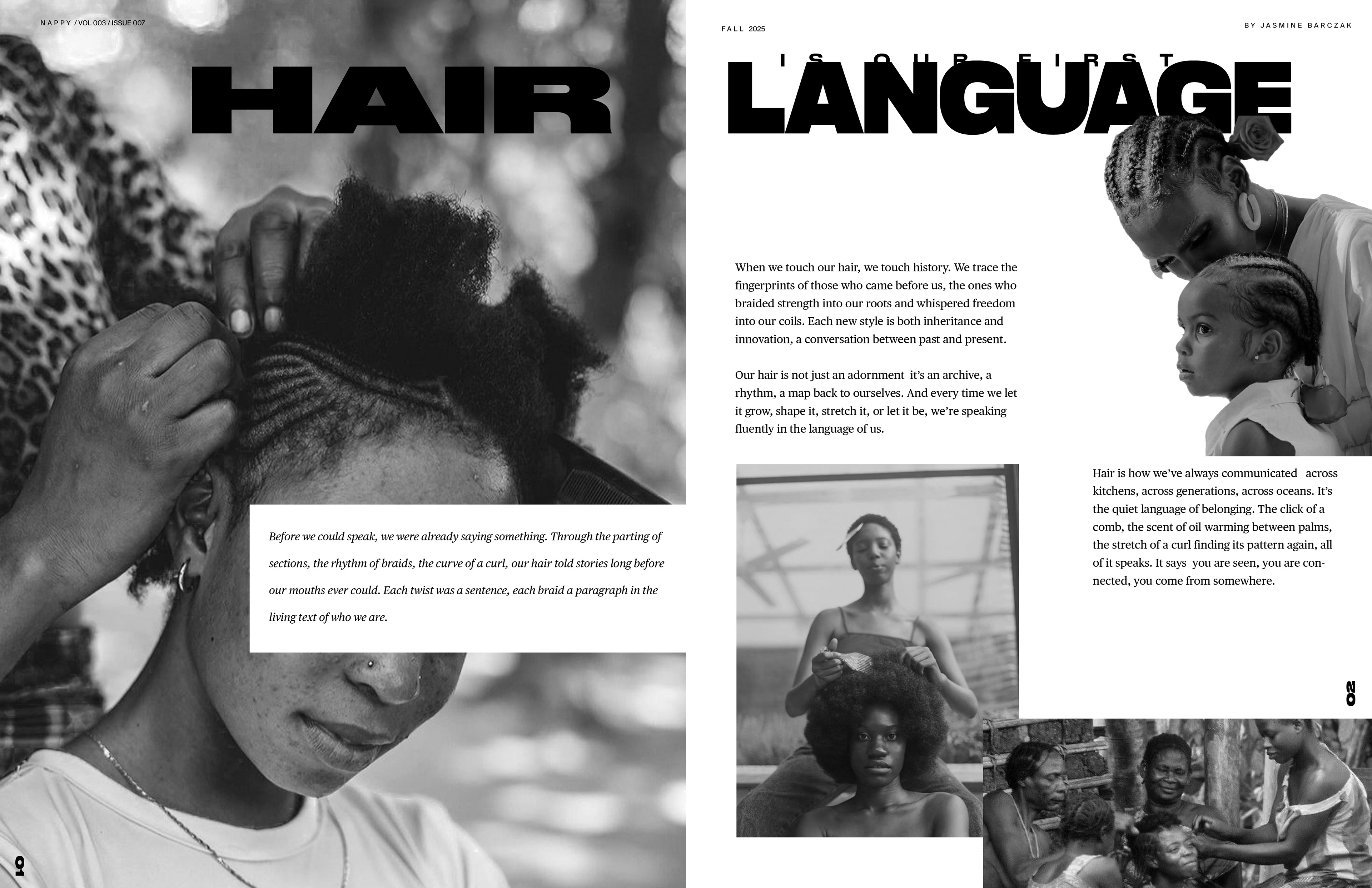
The final feature article is a beautiful story beginning with the origins of natural hair, including ancestral hairstyles and cultural status, and ending with modern day styles and traditions. It highlights the ostracization of natural hair, often being labelled "taboo" and "unprofessional" in society, and reshapes those negative perceptions into something to love and be forever proud of. A split complementary, jewel and earth toned color palette was intentionally chosen to reflect the rich, cultural history that natural hair holds and the fertile, African lands it originates from, and also plays on the saying of "split-ends" in hair terminology.
INTERVIEW ARTICLE CONCEPT EXPLORATION
COLOR STUDIES
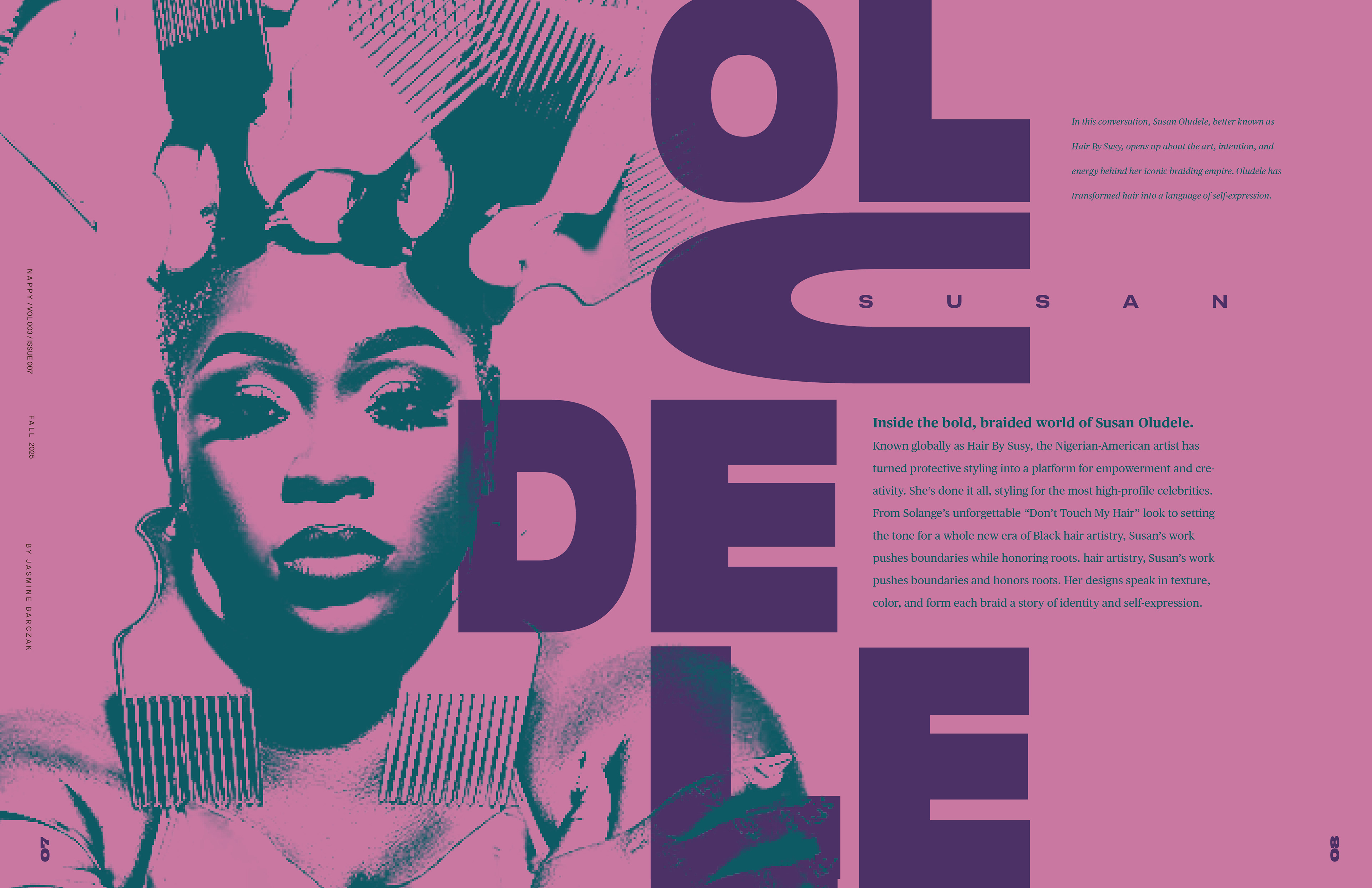
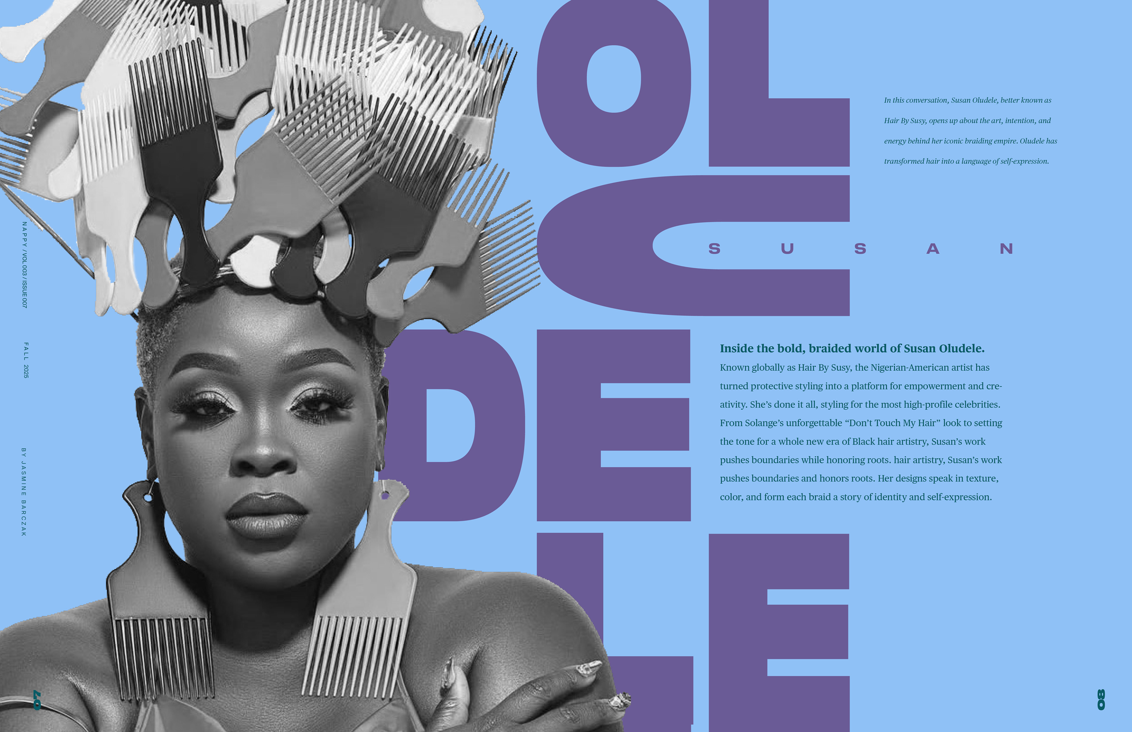
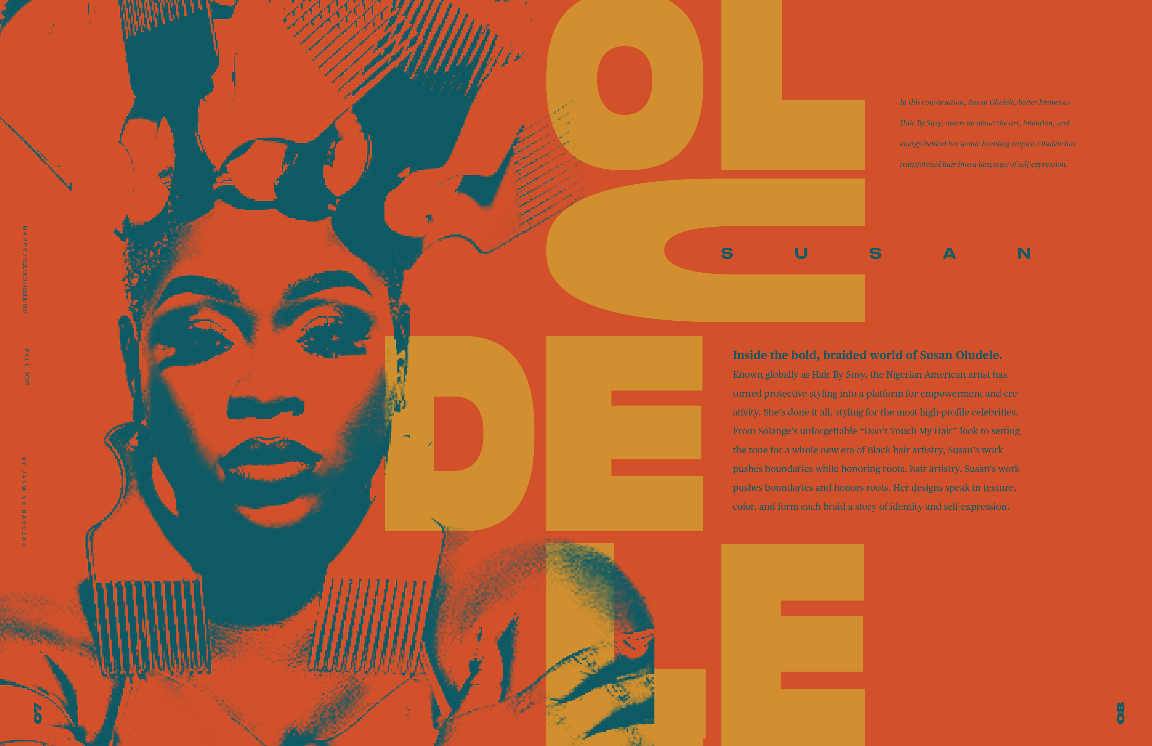
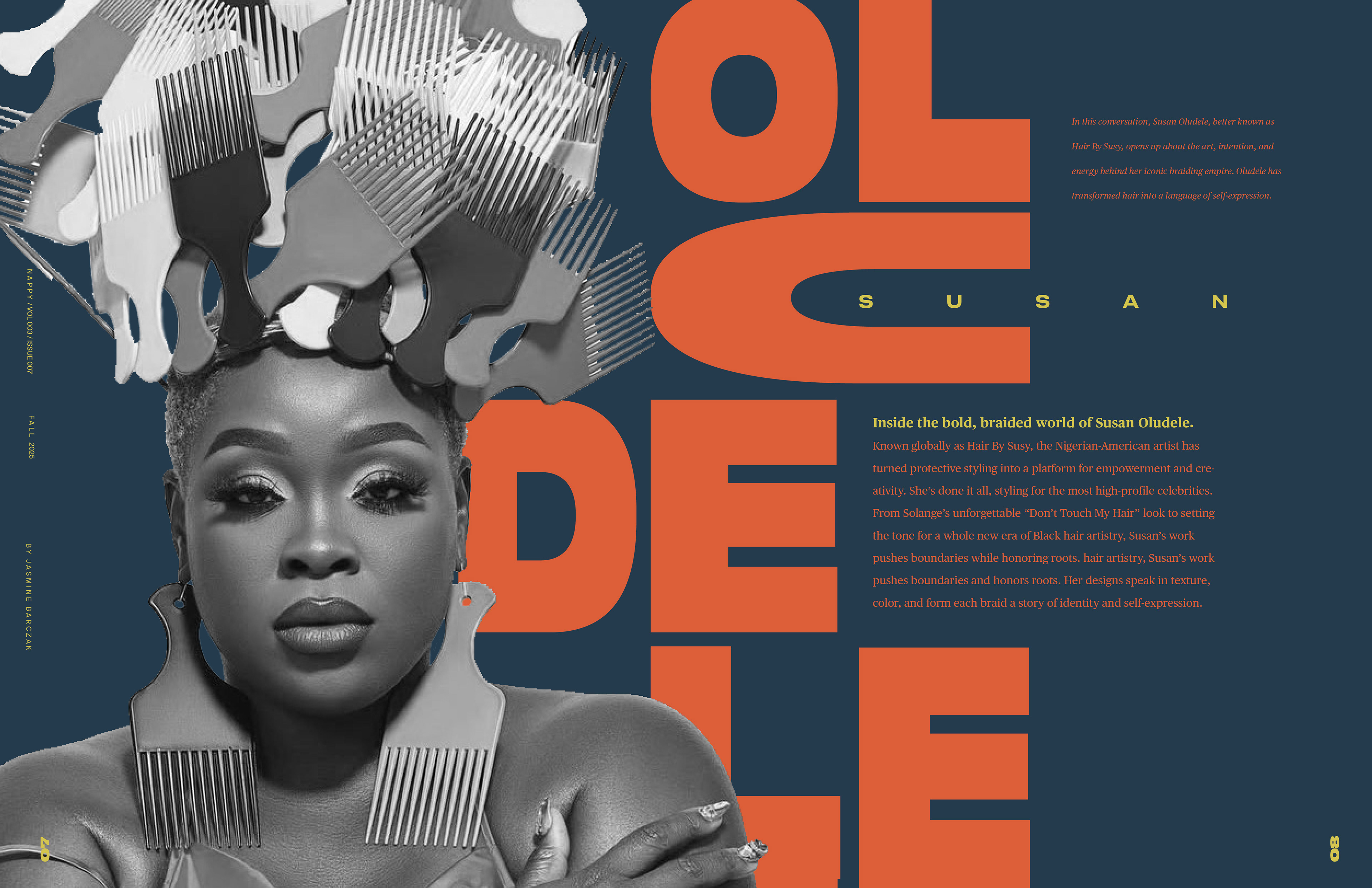
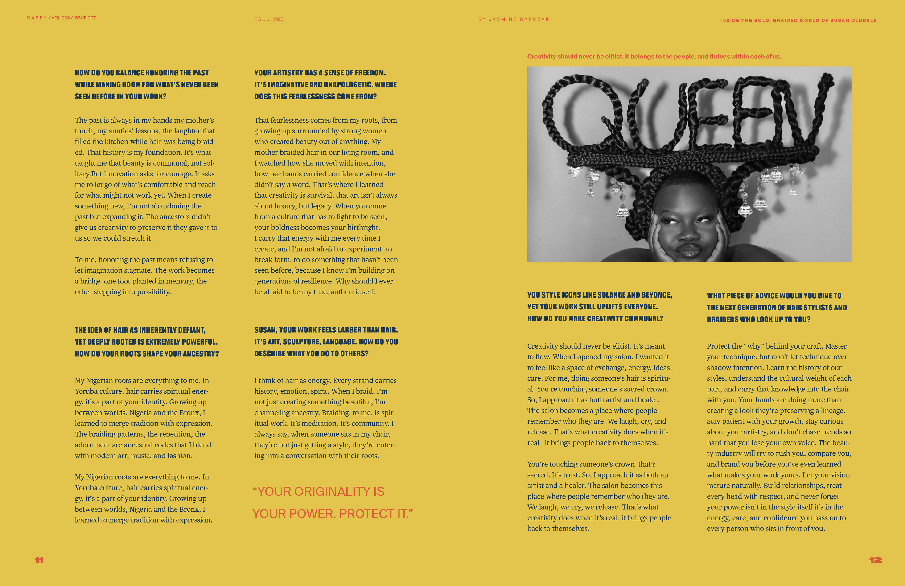
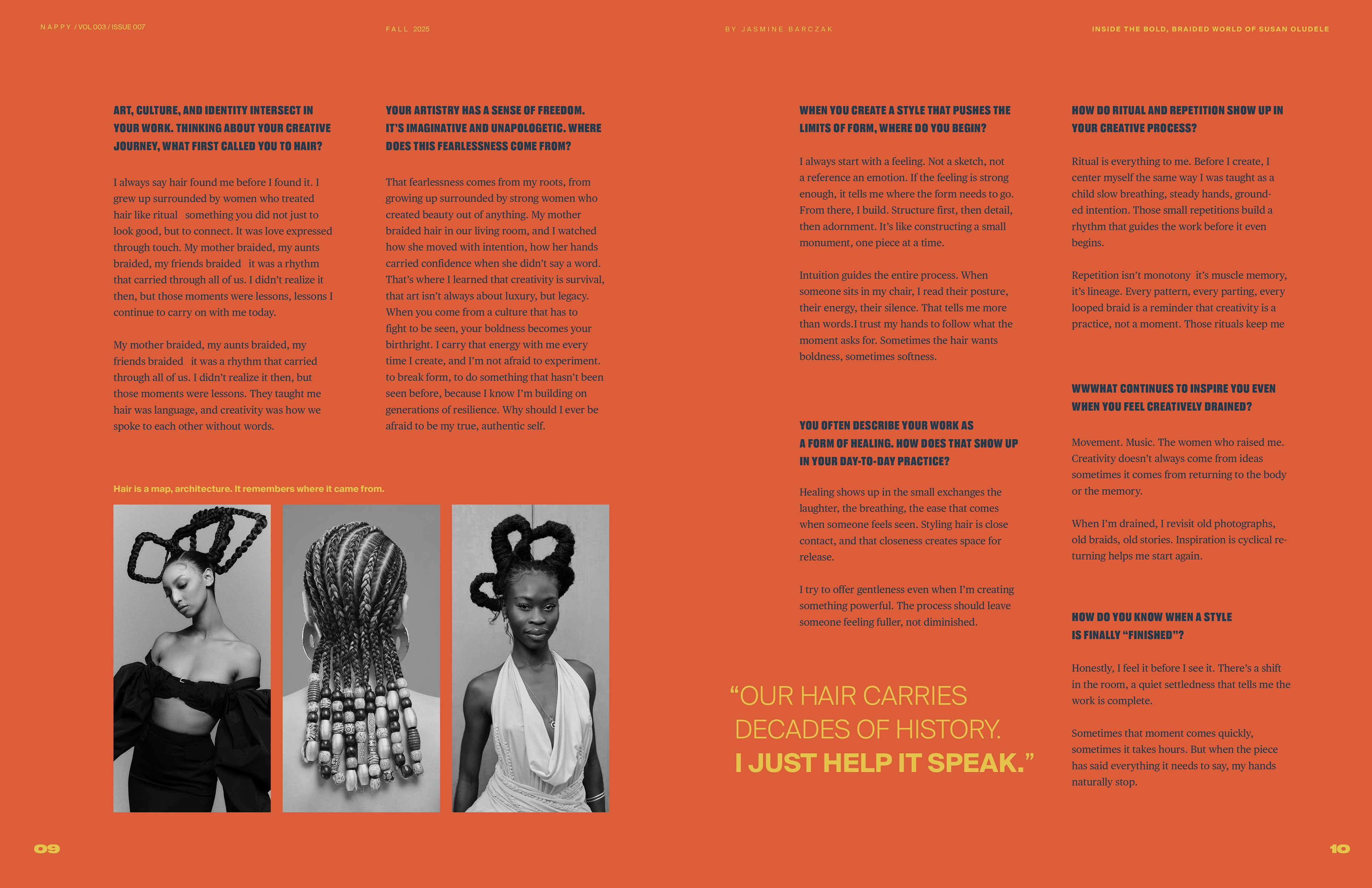
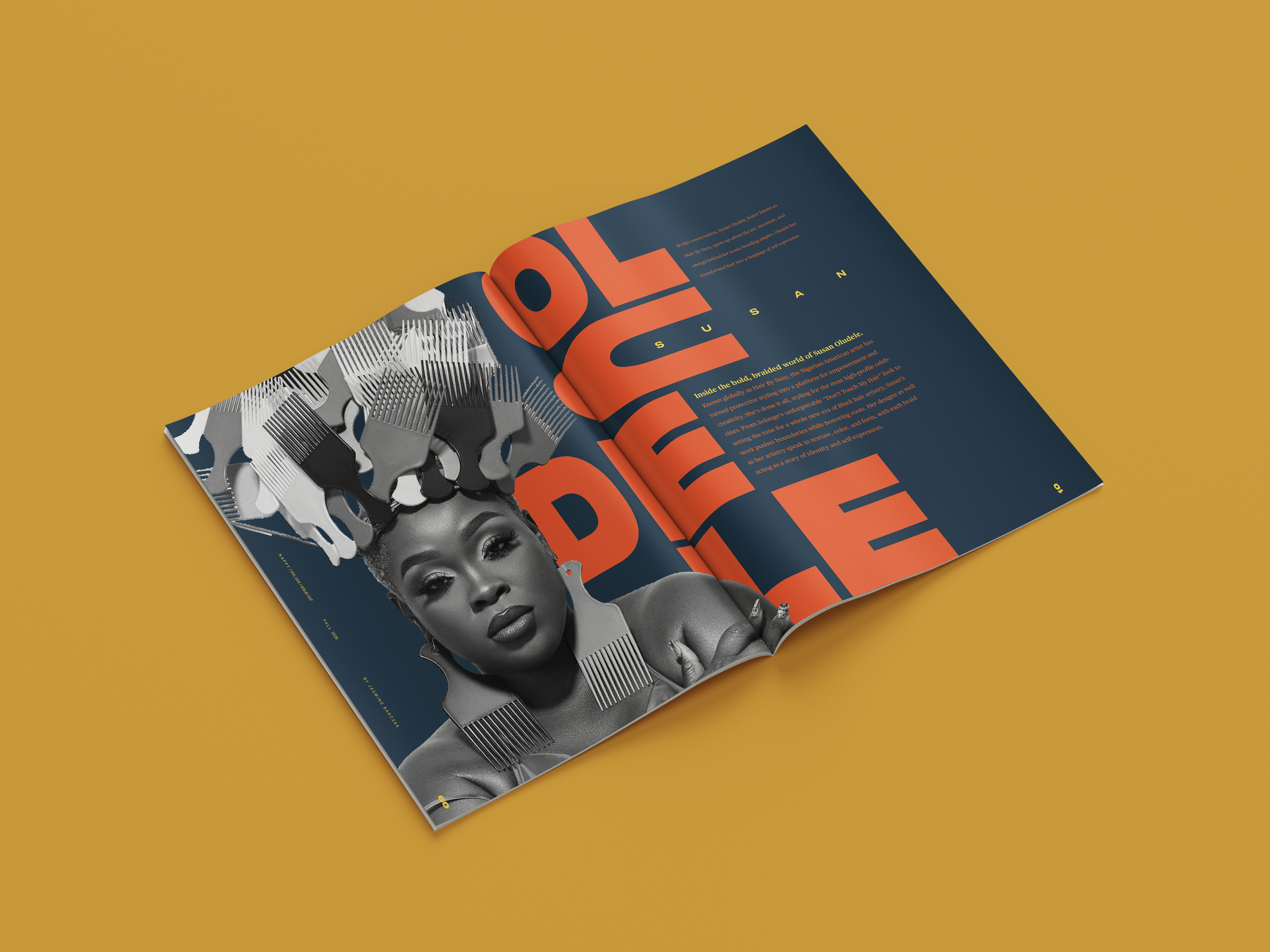
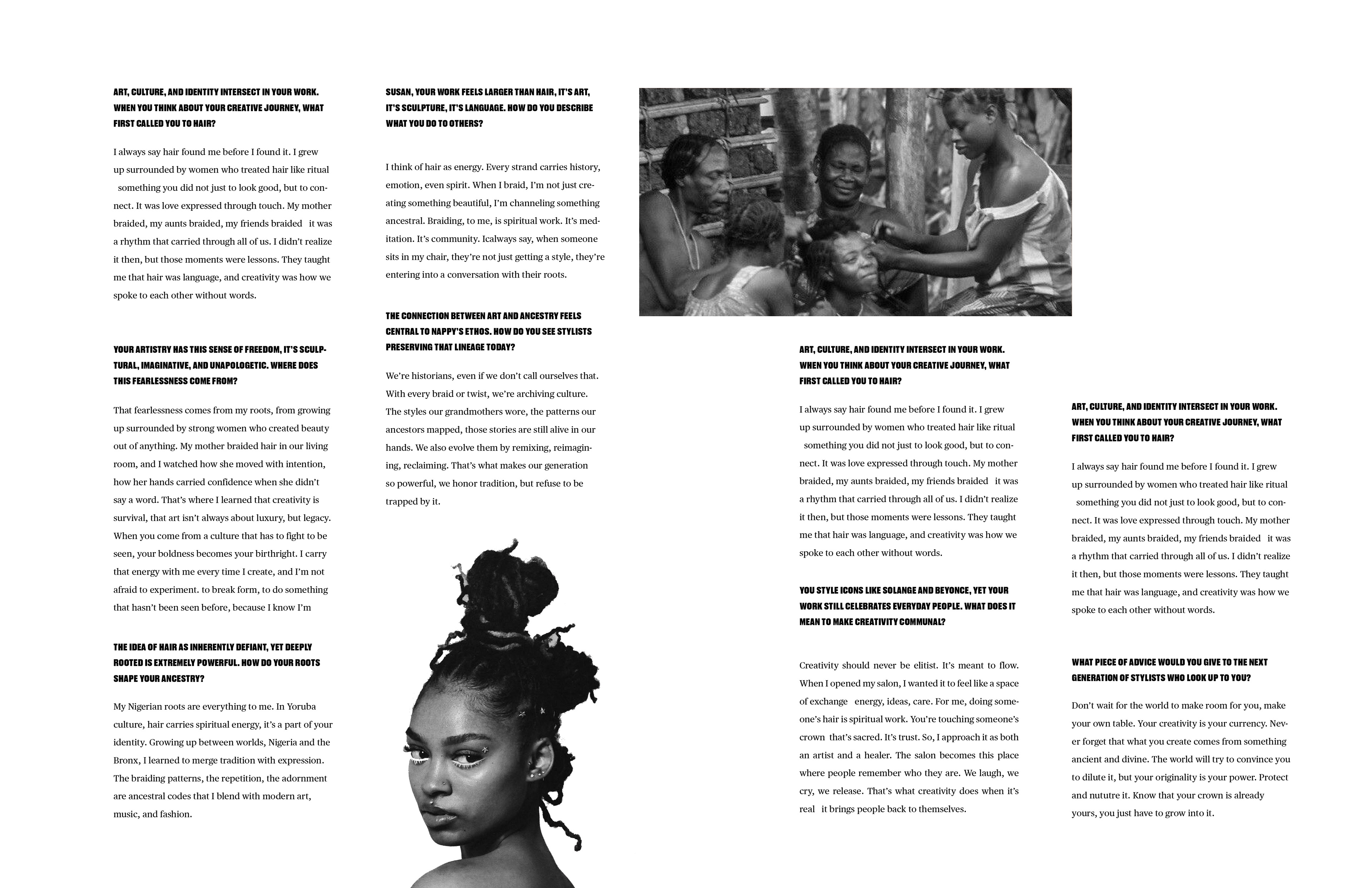
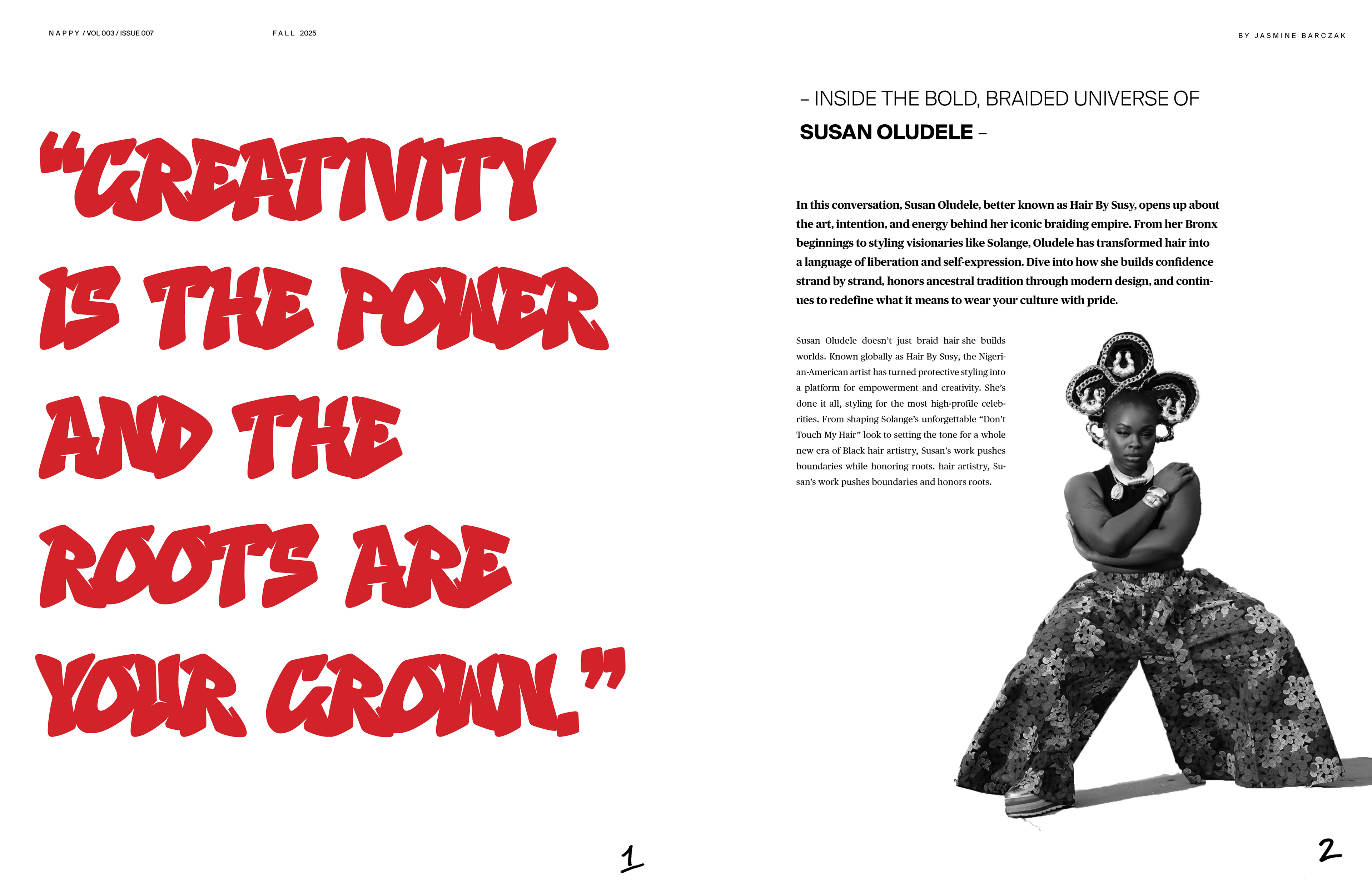
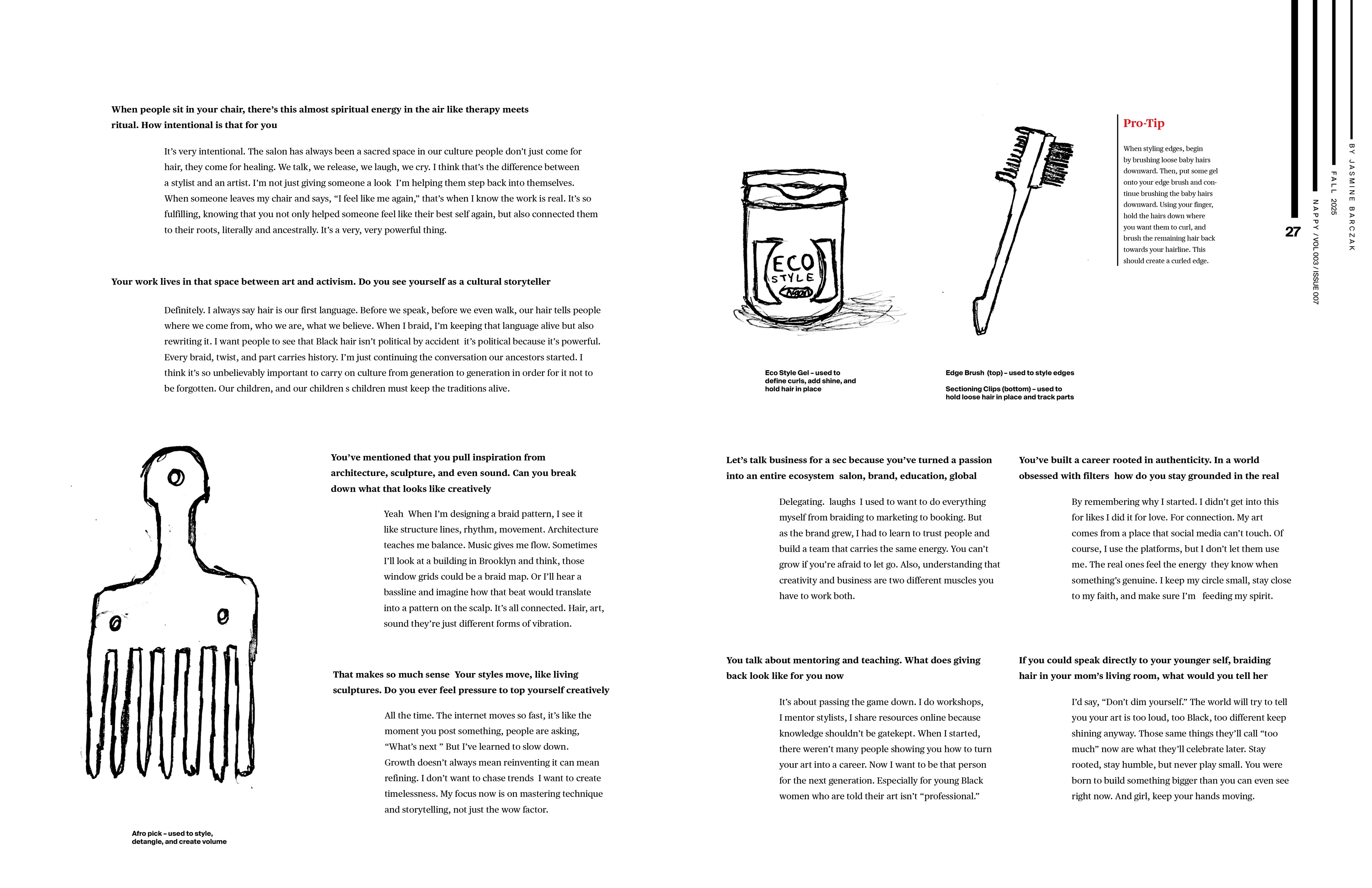
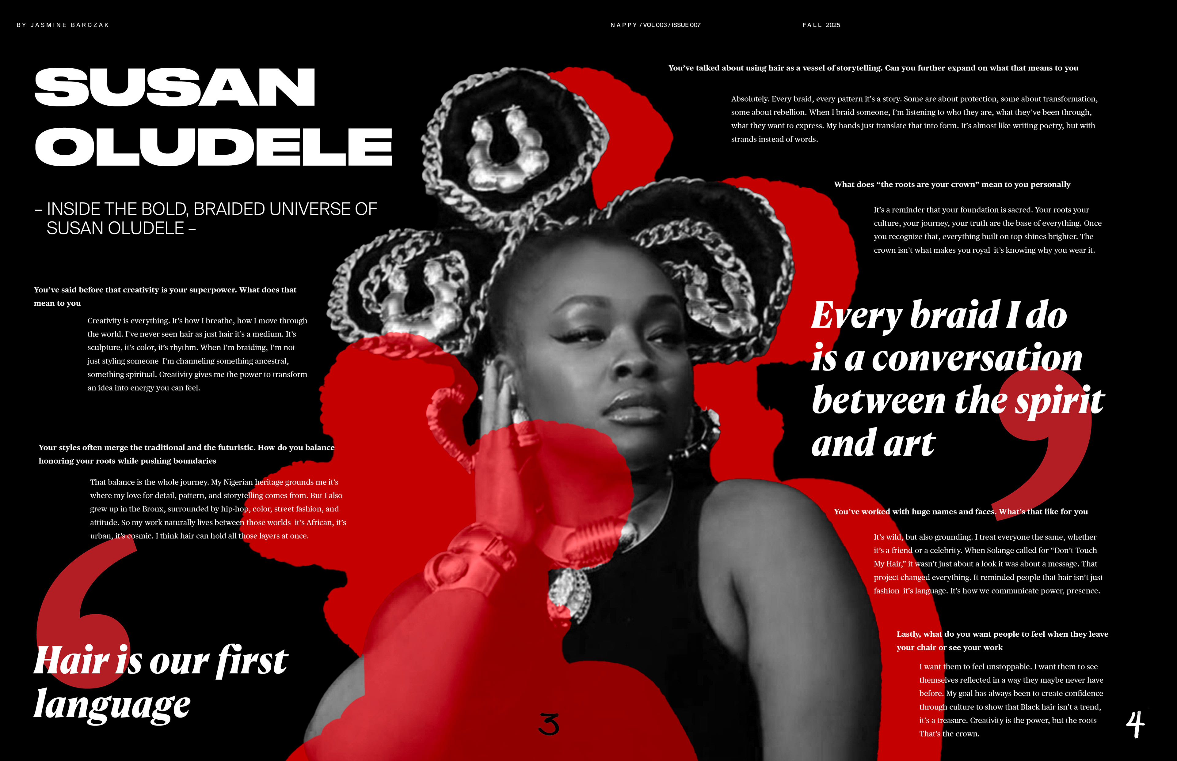
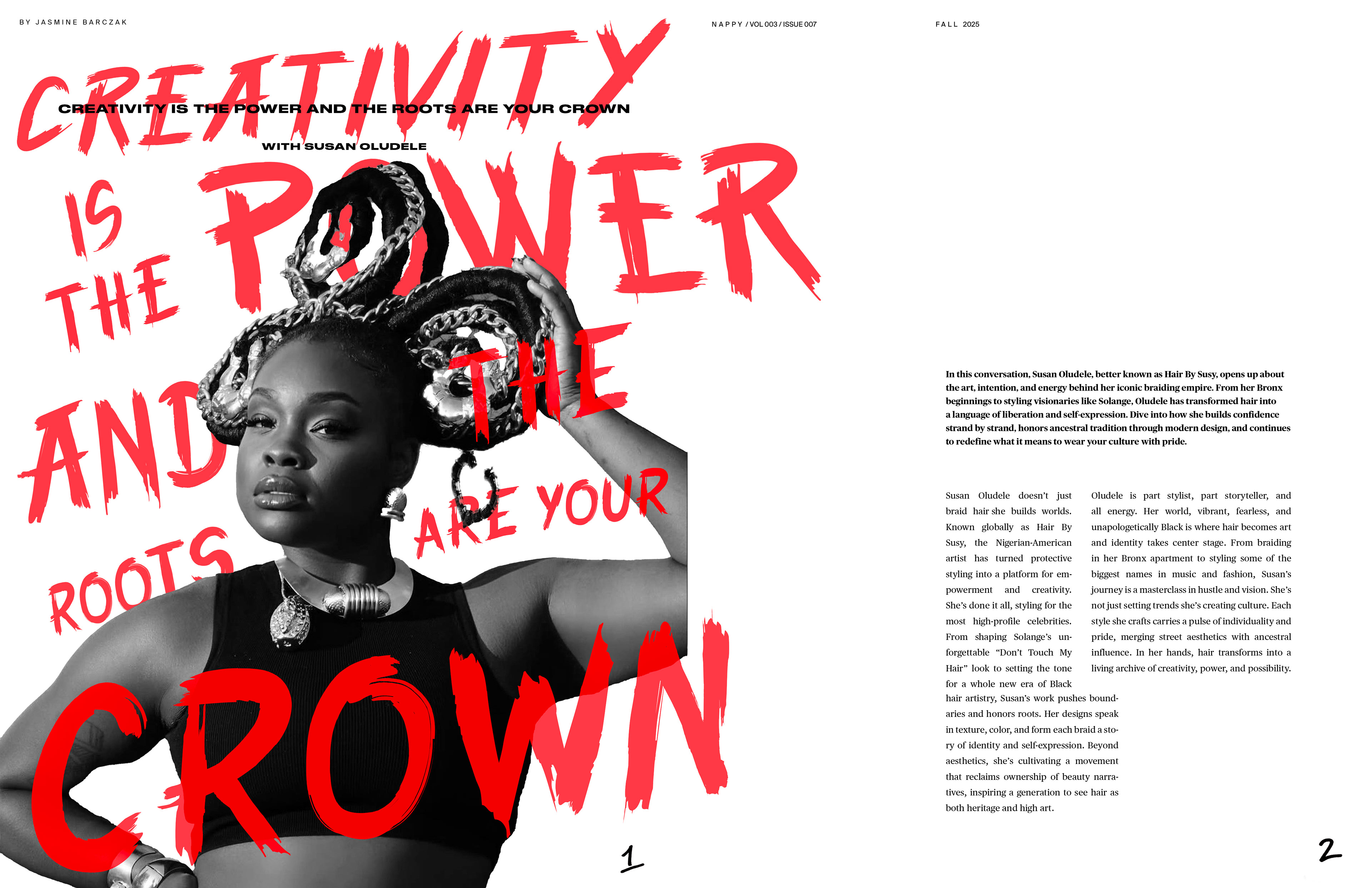
FINAL INTERVIEW ARTICLE

The final interview article works beautifully with the feature article, continuing with another split-complementary color palette paired with powerful black and white images, but also stands strongly on its own. While still maintaining the feel of the publication, it also acts as an ode to the interviewee, Susan Oludele, a powerful force on her own. Her bolded name reflects her bold personality and immeasurable talents, a pioneer in her own right. This article successfully celebrates her and her structured work via elements such as structured body copy, which still fitting in with the rest of the publication.
FINAL PAGES
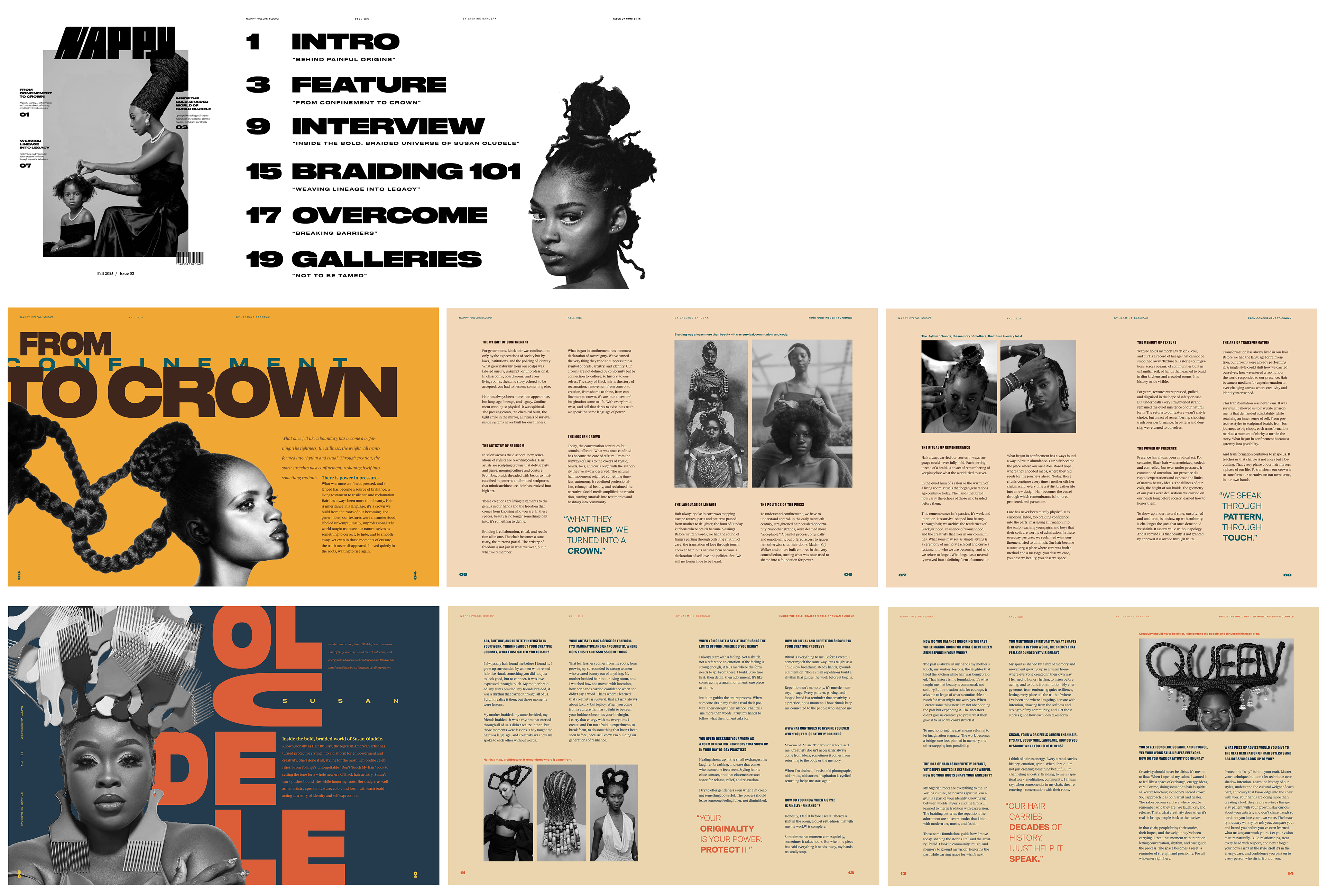
The final publication is a powerful, emotional celebration of black culture and the beauty of their natural hair. The origins, structure, and meaning behind natural hair can be found in every element of this publication, from the word mark, to the typography and its layout, to the color palettes, to the imagery choices. Natural hair is a deep-rooted part of black identity, holding everything from generational trauma, to slavery escape routes, to social status, to pride. Every element was an ode to what society tried to contain, reclaiming it once and for all.
SPEC SHEET